A landing page for Blue Dragon Children's Foundation
Overview
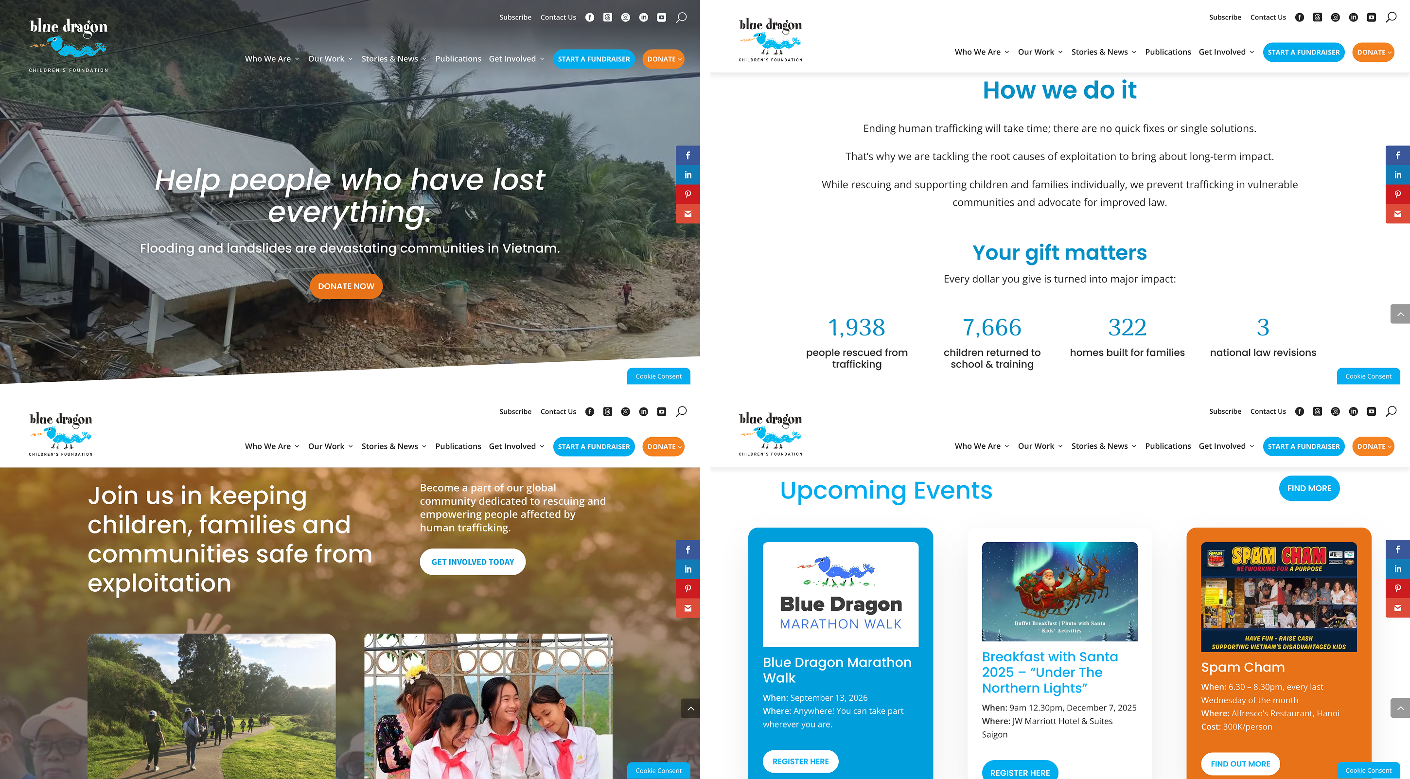
Blue Dragon Children's Foundation is a Vietnam-based NGO helping children and families in crisis. They work directly with high-risk communities, host events to raise funds and awareness, rescue children from abuse, and and provides opportunities for employment, shelter, and education. This is an independent project to design a landing page to encourage viewers to get involved with Blue Dragon's activities.
Role
Visual Designer
Tools
Figma, Adobe Illustrator, Photoshop
Duration
Feb – Mar 2023 (5 weeks)
Challenge
Blue Dragon's homepage provides a lot of information and call-to-actions for first-time visitors.
Blue Dragon's homepage is doing many things well: there's adequate and updated information for the audience to get a good idea of their cause, and their branding is unique and cohesive. However, the website would benefit from a more focused landing page that effectively raises awareness and persuades the audience to get involved.
This project aims to accomplish the following:
Highlight Blue Dragon's key goals and impacts
Utilize rhetorical tropes to create persuasive visuals
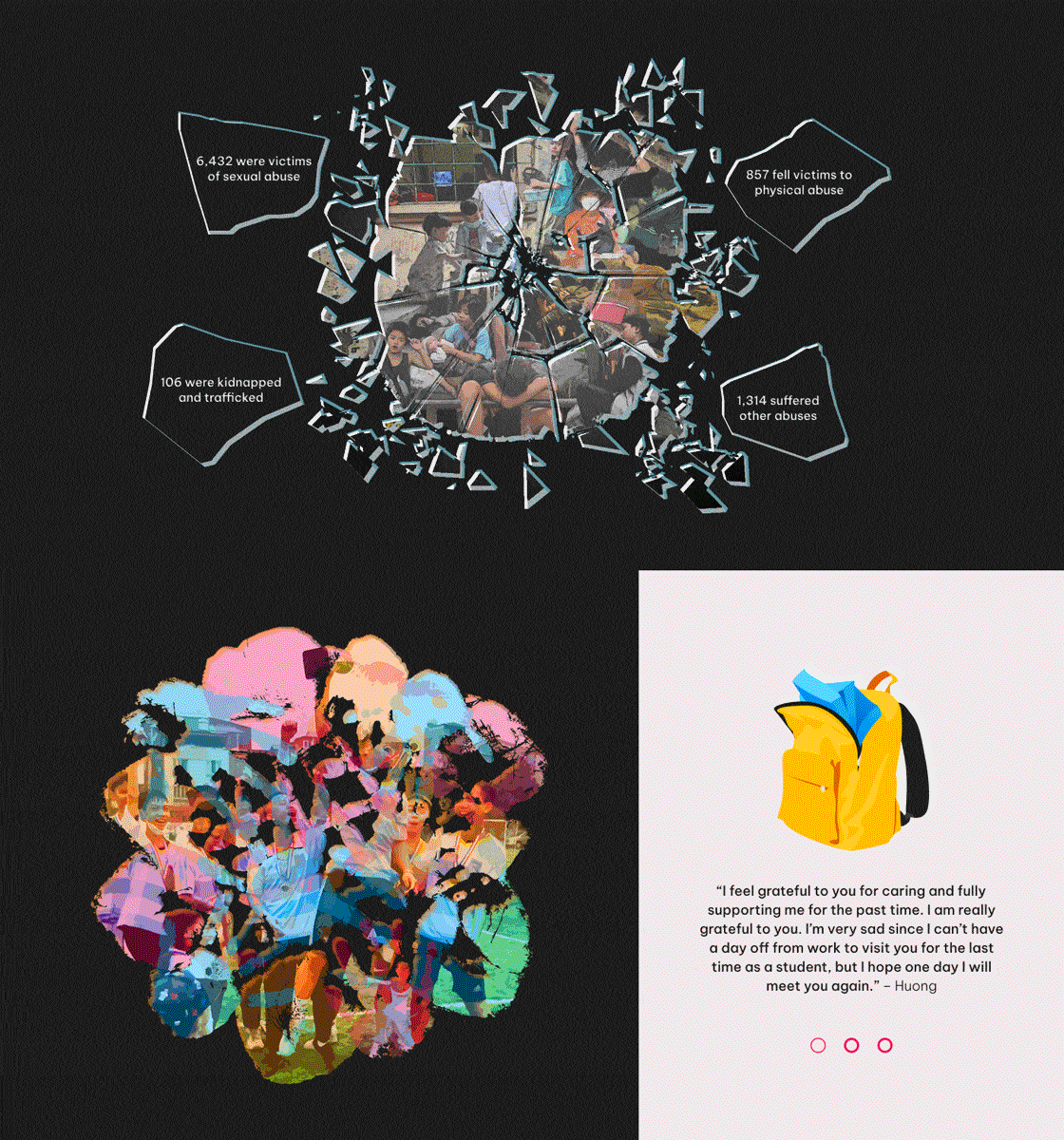
Raise awareness about child maltreatment in Vietnam
Process
I outlined a rough content structure and made low-fidelity iterations. The test audience found key information unclear at first.
During review sessions, I was advised to shorten the paragraphs, highlight the arguments and key information more clearly, and separate different arguments more distinctly. With a better idea of the content to include, I could start defining the visuals.
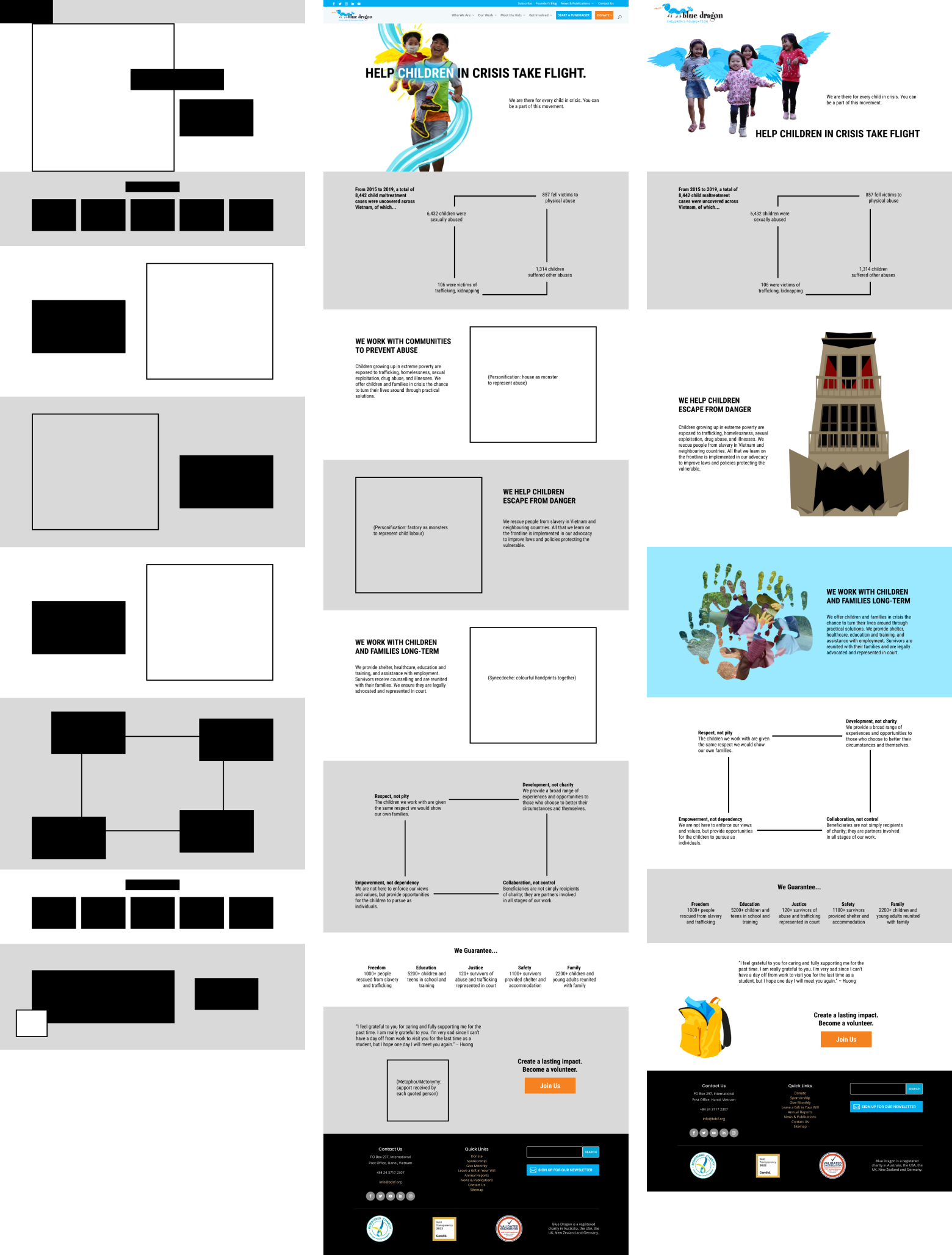
Visual tropes
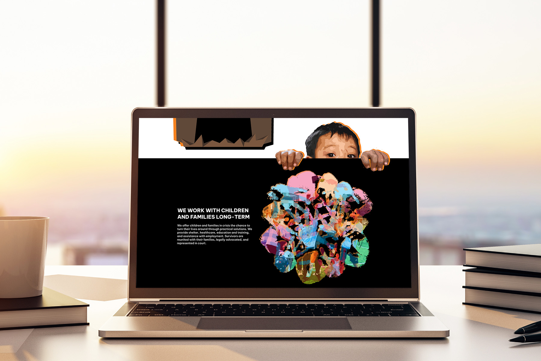
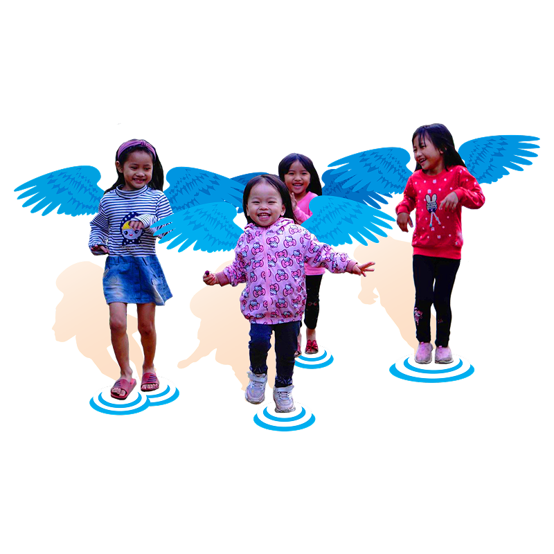
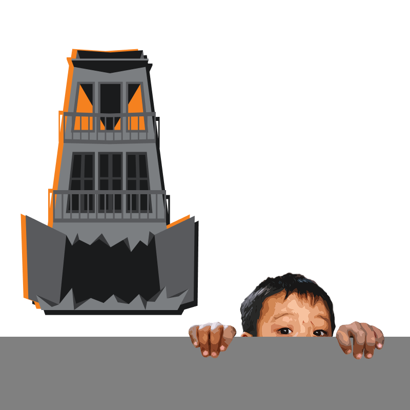
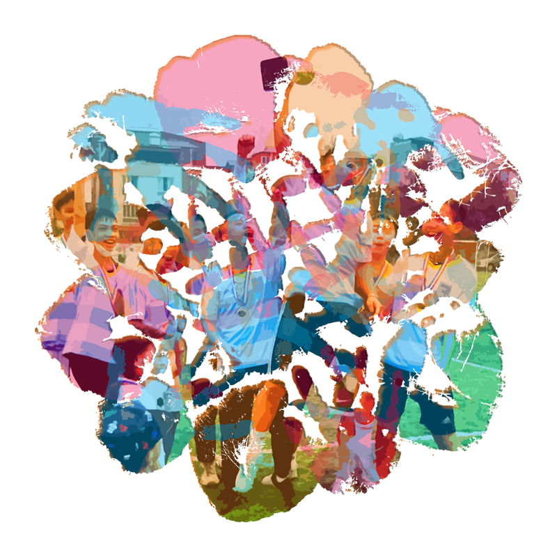
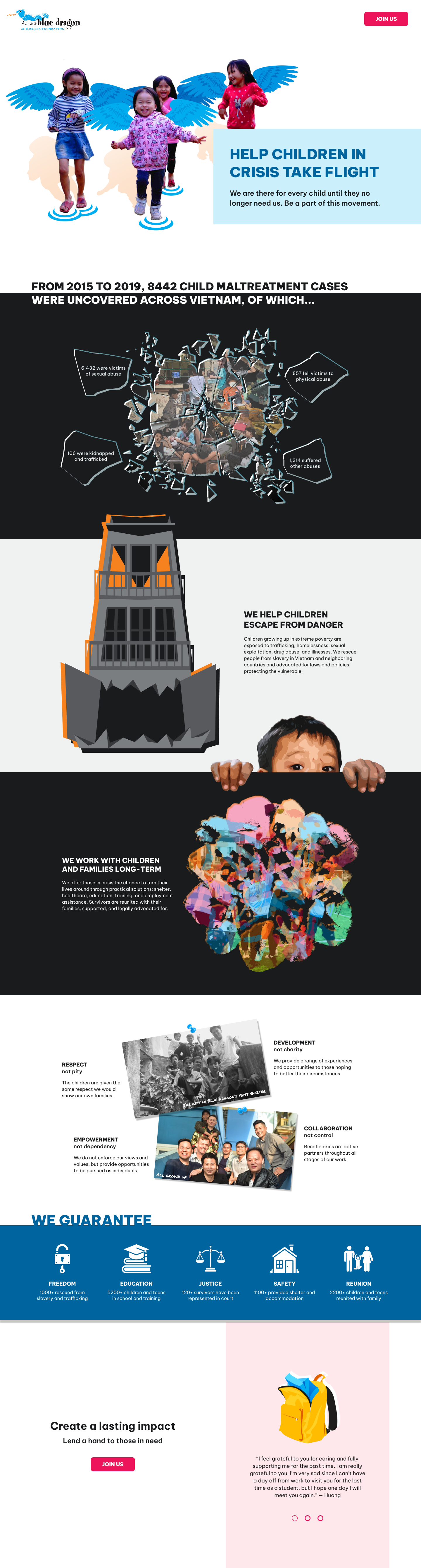
Using key messages from the website, I ideated and created custom visuals with rhetorical tropes, blending photographs with illustrations that tie into Blue Dragon's playful branding.


As the visuals were coming together, I started refining the design in Figma and made adjustments where needed.
To maintain consistency with Blue Dragon's branding, prominent colours from the original website were selected as brand and accent colours. #00AEEF, Blue Dragon's primary colour, highlights the organization's activities and values. #F58220 represents dangers and crisis situations, and #ED145B shows the care and love the children should receive.
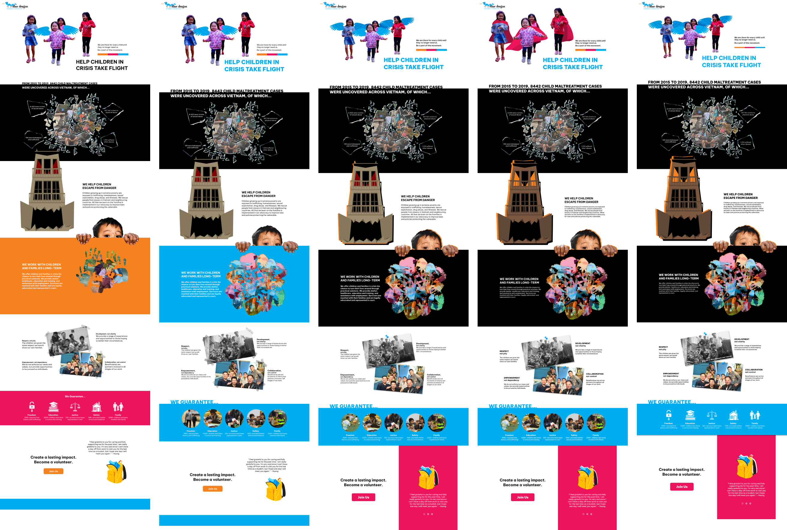
I revised the colour palette to improve colour contrast and cohesion.
Some of the original colours were too bright and clashed when put next to each other, so I worked on the colour scheme to improve colour contrast and harmony. I chose Be Vietnam Pro as the primary typeface because it supports Vietnamese diacritics and looks good in both English and Vietnamese.
Blue Dragon
Rồng Xanh
Be Vietnam Pro
#CCEFFC
#00AEEF
#00649E
#FEE8EB
#ED145B
#F58220
#1A1B1C
I made simple interactions and animations to add more engagement.
Outcome
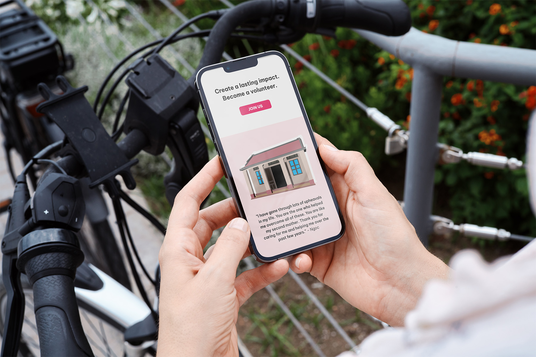
A separate, focused landing page more effectively conveys Blue Dragon's key activities and impacts.
Take a (static) look at the landing page design!

Reflection
01
Rhetorical tropes expand the opportunity for more creative and meaningful imagery. In review sessions, the custom visuals were more impactful than the photographs—the winged children and monster house especially resonated with the test audience.
02
I really saw the importance of ideation and setting a strong foundation in web design during this project. Although I brainstormed ideas for the visuals, I didn't explore different layouts enough and lost out on more creative designs.