Developing a shopping calculator to improve newcomers' shopping experience in Canada
Overview
The differences in currencies and tax systems hinder newcomers' ability to efficiently manage their finances when shopping in Canada for the first time. This project aims to address this challenge and offer a more convenient shopping experience for visitors and new residents by converting prices from Canadian dollars to a currency familiar to the user, while calculating the total cost of the shopping trip. This is a class assignment turned personal project that I started when I was a first-year Interaction Design student. I revisited this project in my fourth year to improve it using what I had learned and practiced.
Tools
Adobe XD, Figma, HTML, CSS, JavaScript
Timeline
Jan – Apr 2022 (original concept)
December 2024 & March 2025 (redesign)
The challenge
How might we design an application to help newcomers and visitors in Canada navigate the differences in currency and sales tax system?
Newcomers and visitors are likely to encounter difficulties while shopping due to the difference in currency. Managing finances becomes more time-consuming as shoppers struggle with an unfamiliar currency and sales tax system. During my research into how people adapt to new currencies, I found that the most common advice offered is to "give it time, and you'll get used to it." However, amidst the challenges associated with relocating, this additional obstacle may inadvertently heighten stress.
Conceptualization
I looked into online discussions and researched available tools. Based on my findings, I made user personas to capture user needs.
There are many shopping calculators tailored for Canadian users and currency conversion apps, but these applications usually operate separately from each other and would require users to switch between them to view the currency conversions while shopping. Existing support tools tend to address individual aspects rather than the overall experience.
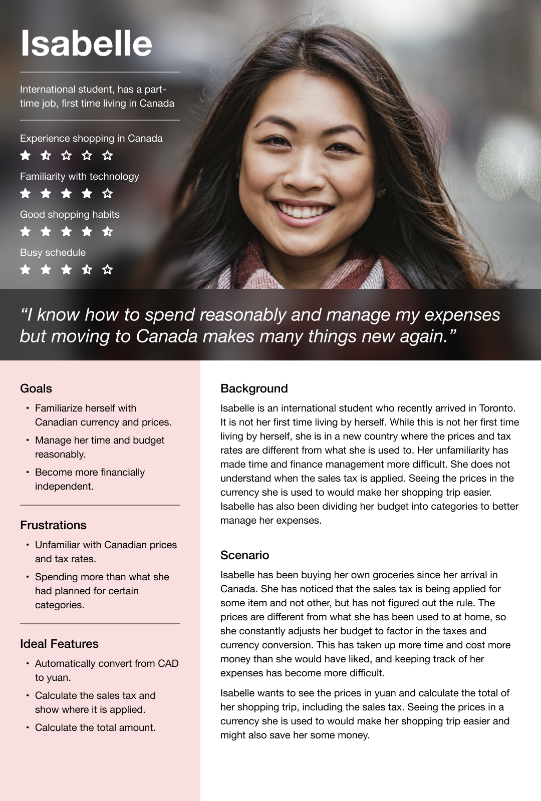
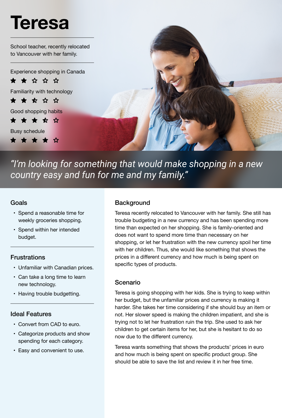
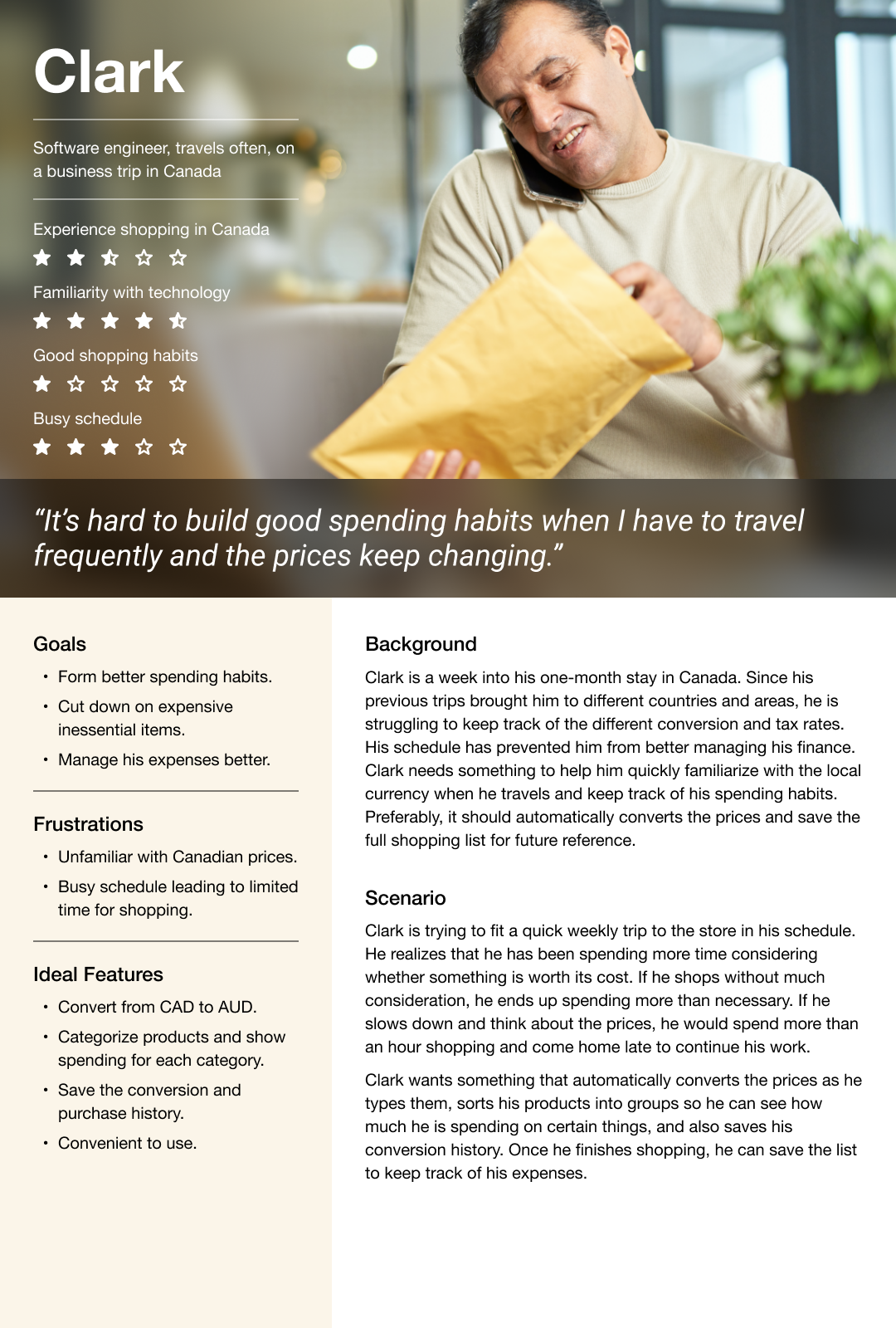
After reviewing what users look for, I outlined primary and secondary features.
Most people have their phone with them when they go out, and some save a shopping list in their notes. A mobile calculator with integrated currency conversion provides user convenience and utility. This application should have the following primary features:
Price conversion
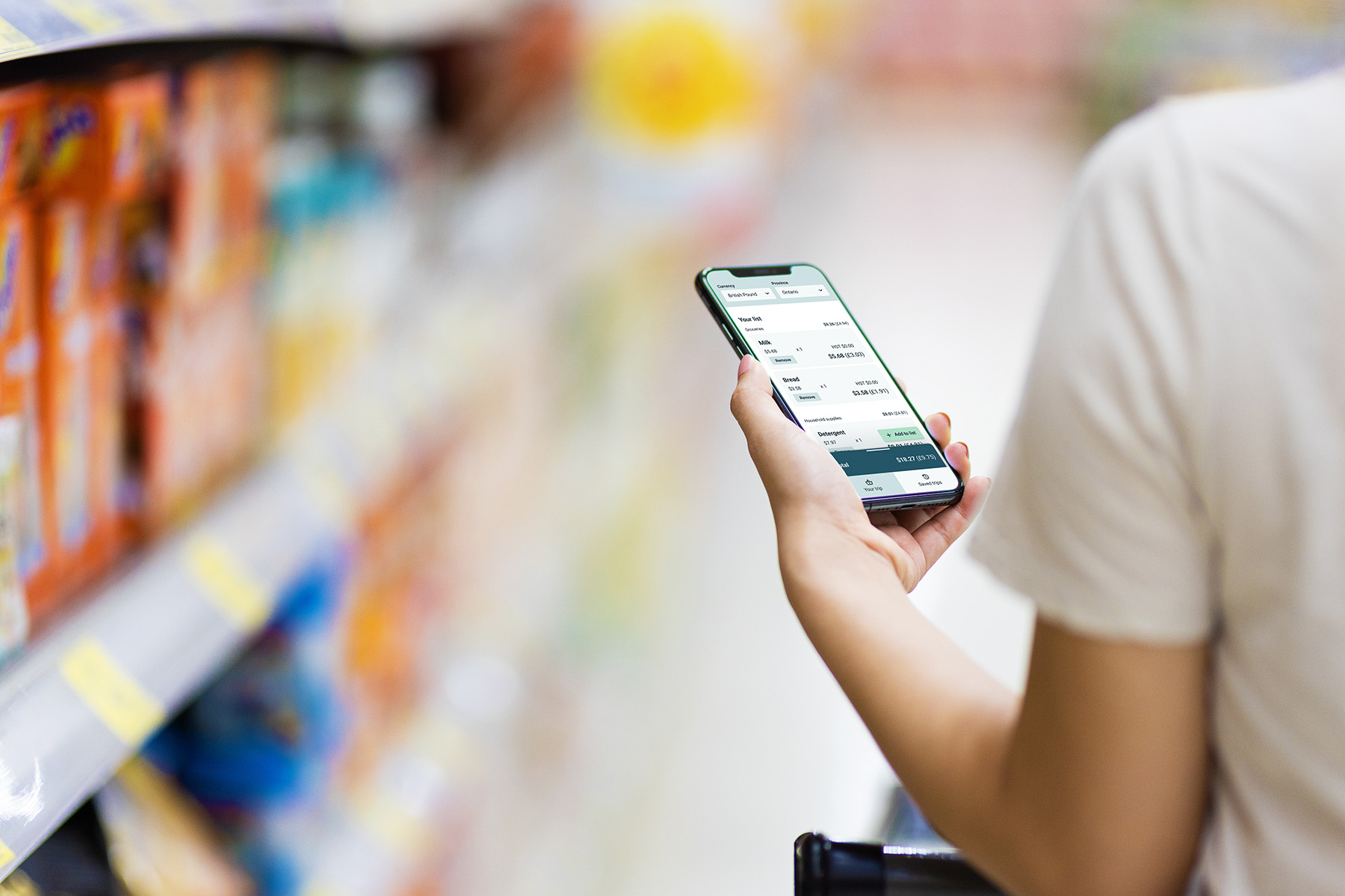
The most important feature is converting the prices and totals on the user's shopping list into the currency the user is familiar with. I wanted to allow the user to preview the conversion before adding the product to their list and checking out.
Sales tax calculation
I wanted to include the sales tax calculation since newcomers may be unfamiliar with the sales tax system. Different provinces have different rates, and the type of product determines whether it is taxable.
The features below are good-to-haves but aren't as necessary:
Edit and delete items
Similar to other shopping calculators, the user should be able to edit the item they've added to their list or remove it from the list.
Categorize products
Since the sales tax is applied depending on the type of product, categorizing the products would be a small and beneficial addition.
Save the list
Allowing the user to save and track how much they've spent could be a useful feature to build financial literacy.
Design
I used paper prototypes to ideate layouts and conduct quick user tests.
Paper prototypes allow for quick testing and require low commitment to the design, so I could make immediate adjustments when needed. I was new to coding, so I was advised to keep everything to one HTML document—thus, one screen. A challenge I encountered early on was fitting a lot of information into one phone screen. To address this constraint, most participants recommended displaying the information gradually (e.g. allowing the user to add their items, then converting the entire list).
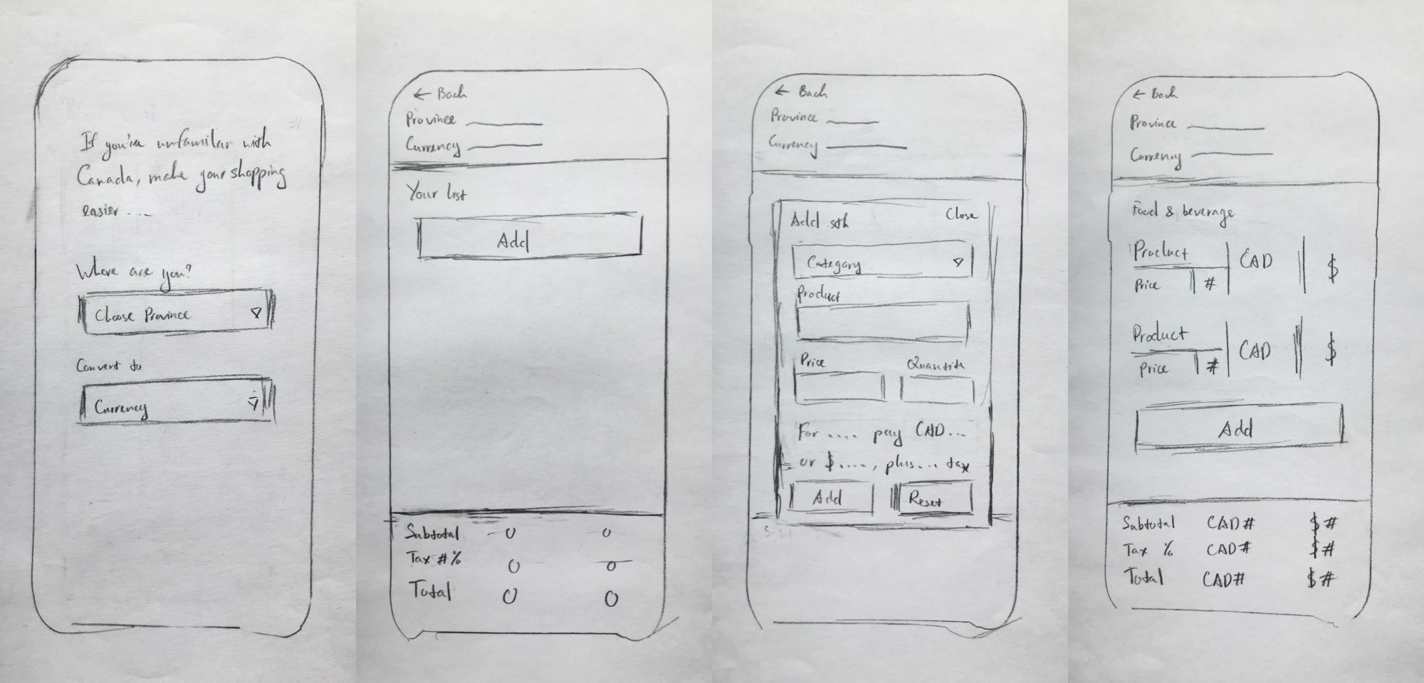
I made wireframes in Adobe XD and continued to refine the design of the app and adjust the features based on my understanding of front-end development at the time.
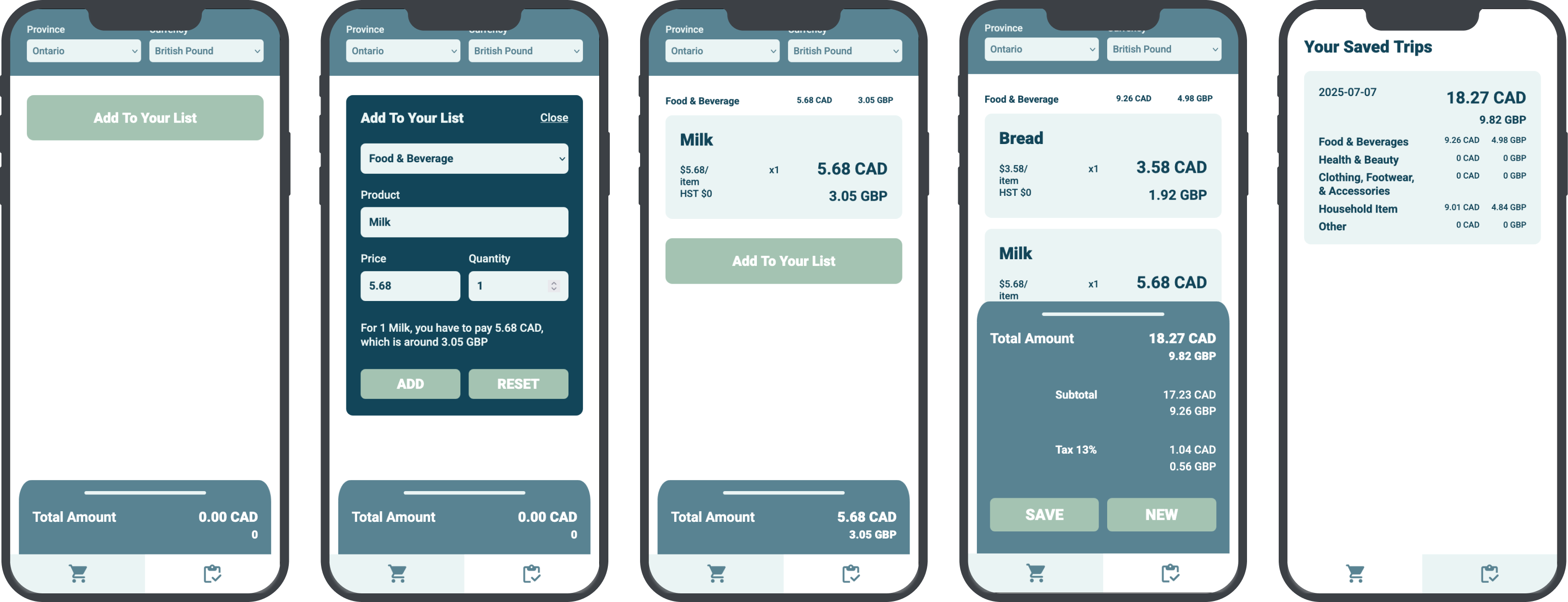
The original wireframes were designed using Adobe XD. From the first to the second iterations, I omitted the initial screens prompting the user to select their currency and province and wanted to replace them with a brief pop-up. The edit and delete features were removed since they might be difficult to code with my limited coding knowledge and experience at the time.
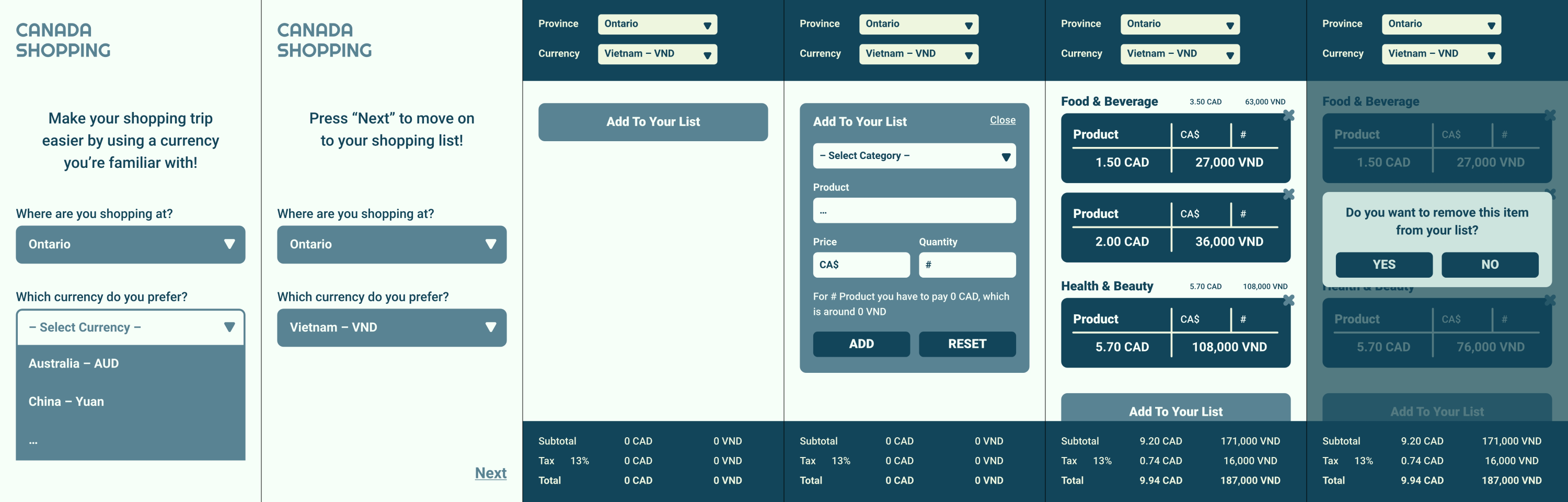
As I progressed in the program, I could identify shortcomings from my initial wireframes and redesign them to better account for the constraints of mobile devices.
The biggest mistake I made when designing the original wireframes was not taking into account the device restrictions. The screen size used was too small, considering the sizes of most phones at the time. Additionally, I didn't consider the native UI elements or the reachability of certain features.
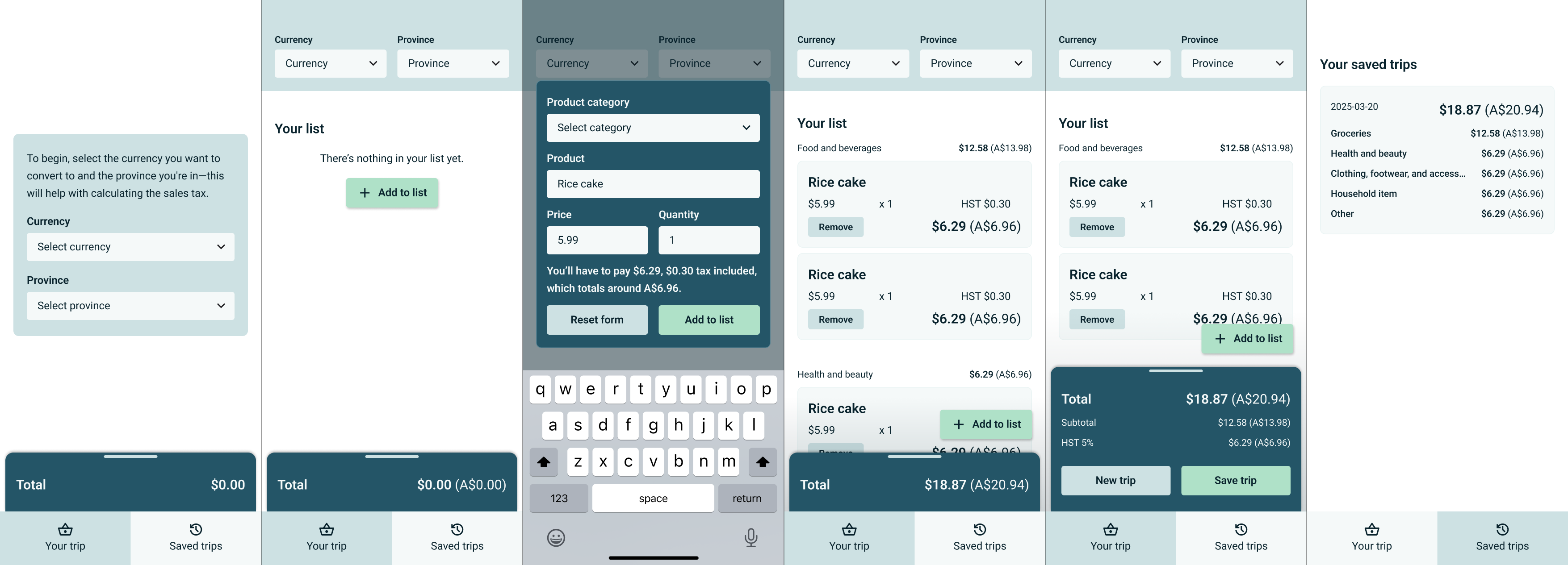
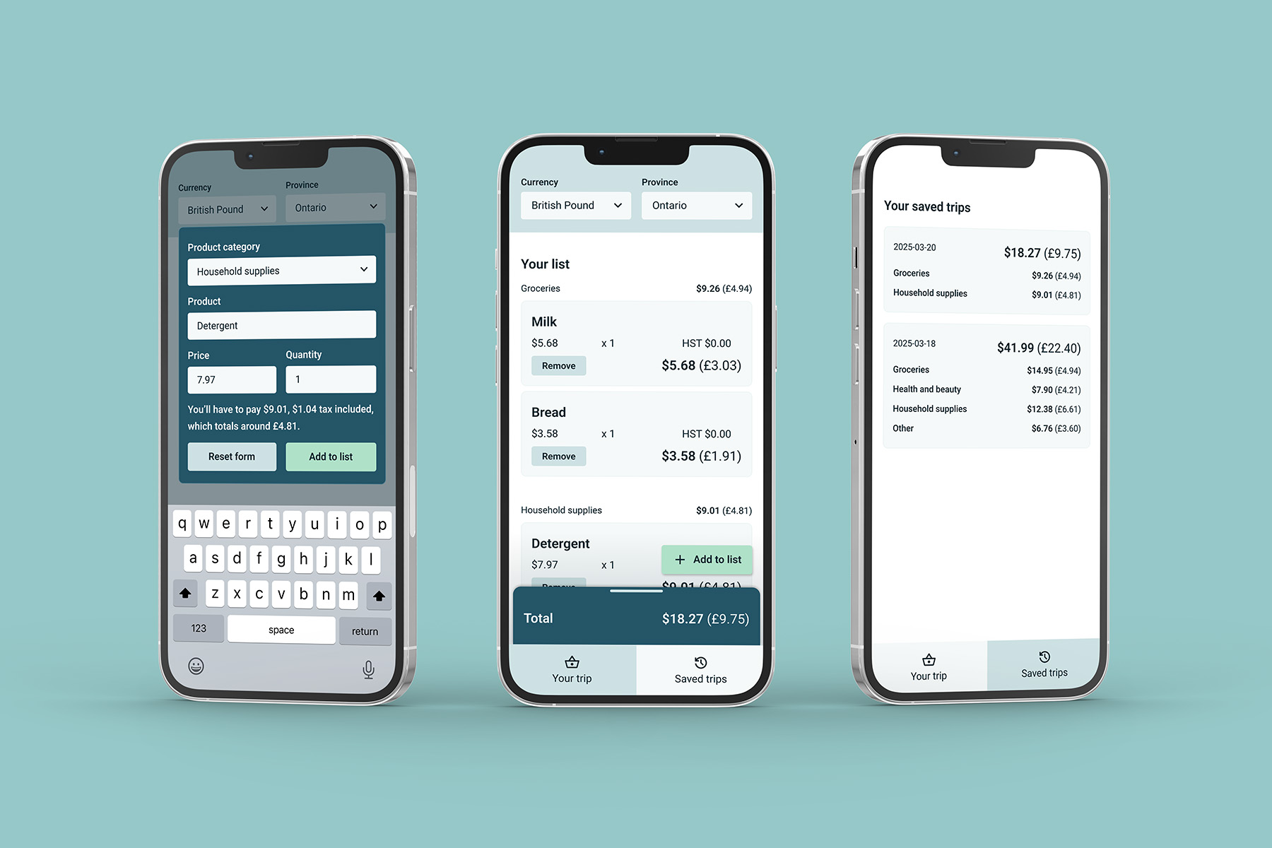
This redesign addressed those shortcomings and applied what I've learned to improve the design. I added a modal at the start to draw more attention to the currency and province dropdowns; users wouldn't have to reach the top of the screen when they first use the app. I put the “Add to list” at a fixed position near the bottom right corner for easier access. I also reworked the colour palette to improve colour contrast; while the original colours look alright to my eyes, they didn't pass the accessibility check
Develop
I coded a prototype with HTML, CSS, and JavaScript, using an API to retrieve real-time conversion rates.
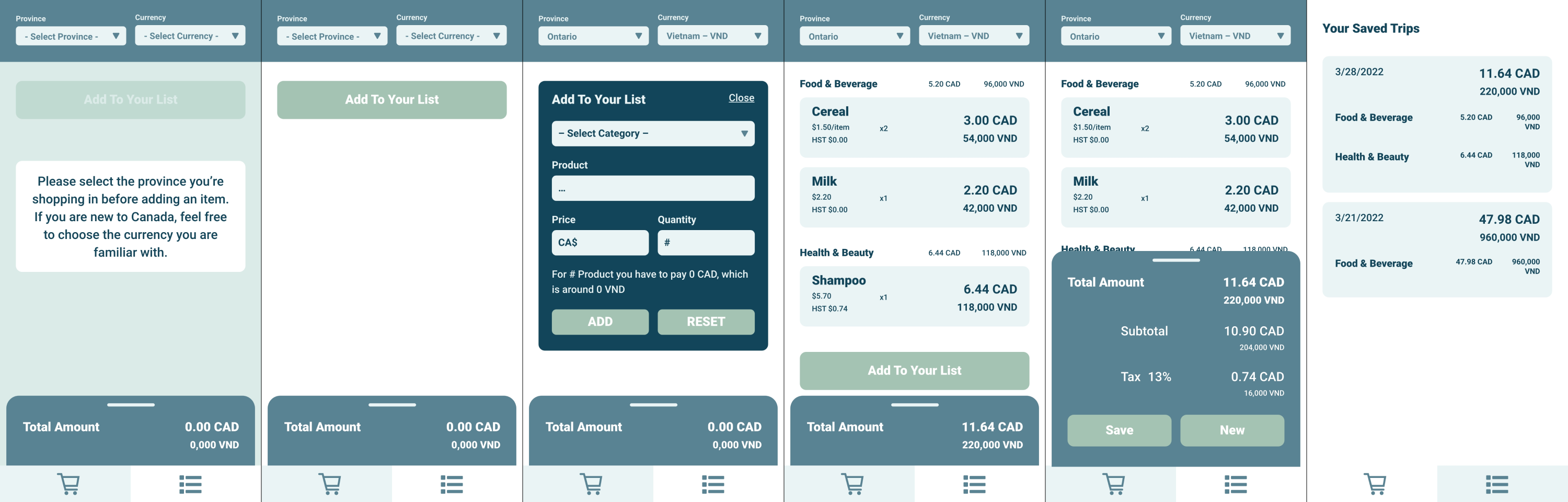
I recreated the original wireframes using HTML and CSS, then worked on the functions in JavaScript. I used Exchangerates.host API to retrieve the conversion rates in real time. Since I hadn't learned about backend databases at this time, I used local storage to allow the user to save their shopping history, which limits the user to two entries maximum.
Although I had made a working coded prototype, the code was messy and inefficient and the interface does not properly account for native UI elements.
When I was inspired to revisit and improve this project, I decided to clean up the initial code and add error handling to improve the user experience.
The first thing I did when revisiting the code was replacing the Exchangerates.host API with the Frankfurter API, the latter of which has fewer available currencies but is more reliable for a small and low-maintenance personal project. The majority of the other adjustments was cleaning up the code and adding error handling to improve the overall user experience.
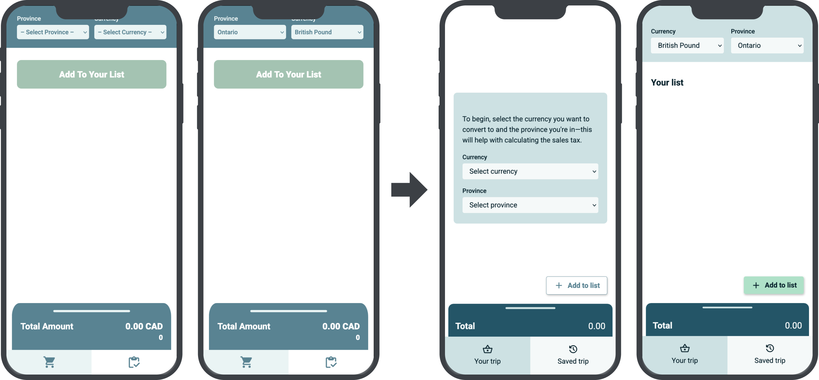
In addition to implementing the onboarding modal to allow users to select their currency and province, I utilized local storage to save the selected currency and province. When this app is used a second time onward, they will have the currency and province pre-selected and can skip the modal entirely.
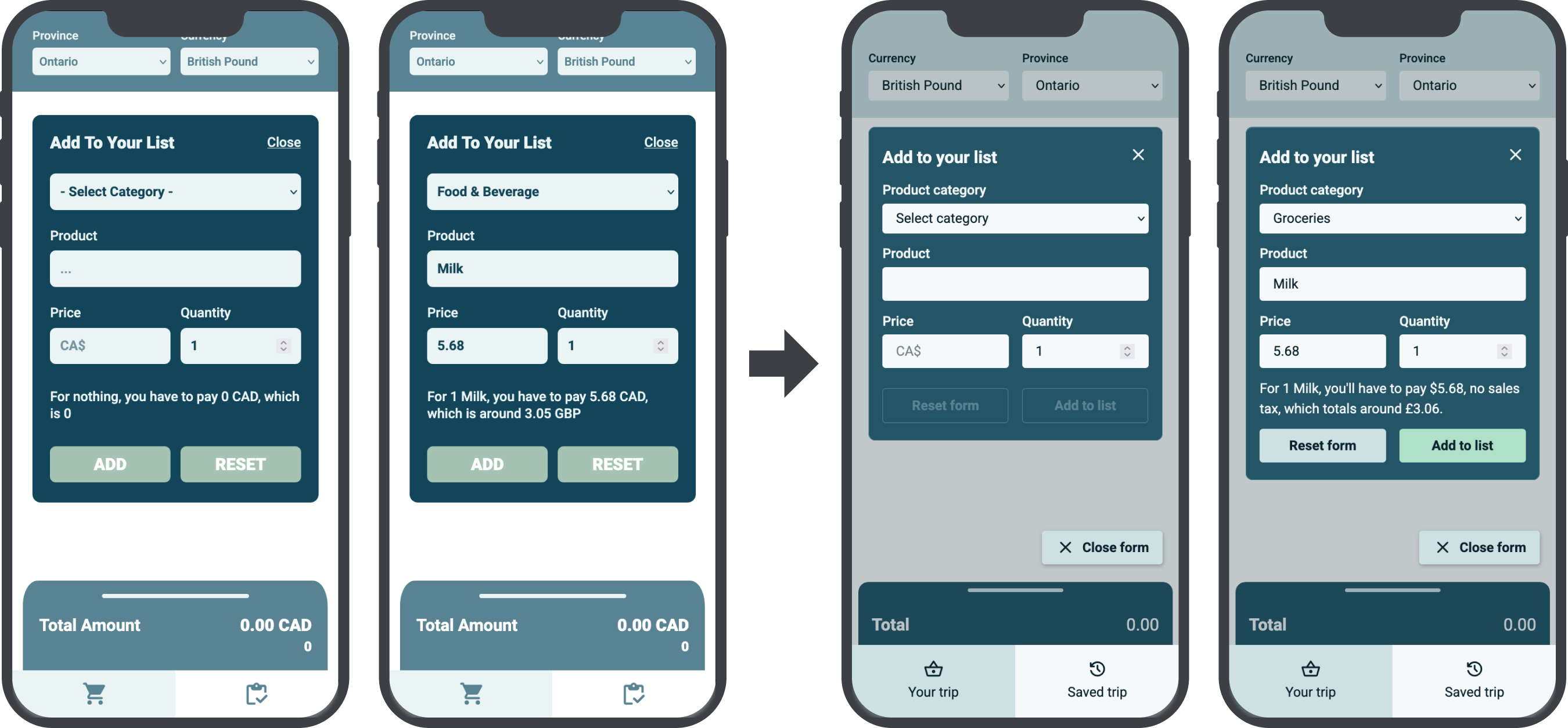
I added a disabled state to the input form, so the user can only tap on the “Add to list” button when they've inputted all the necessary information. I also added a “Close form” button closer to the bottom of the screen to improve reachability.
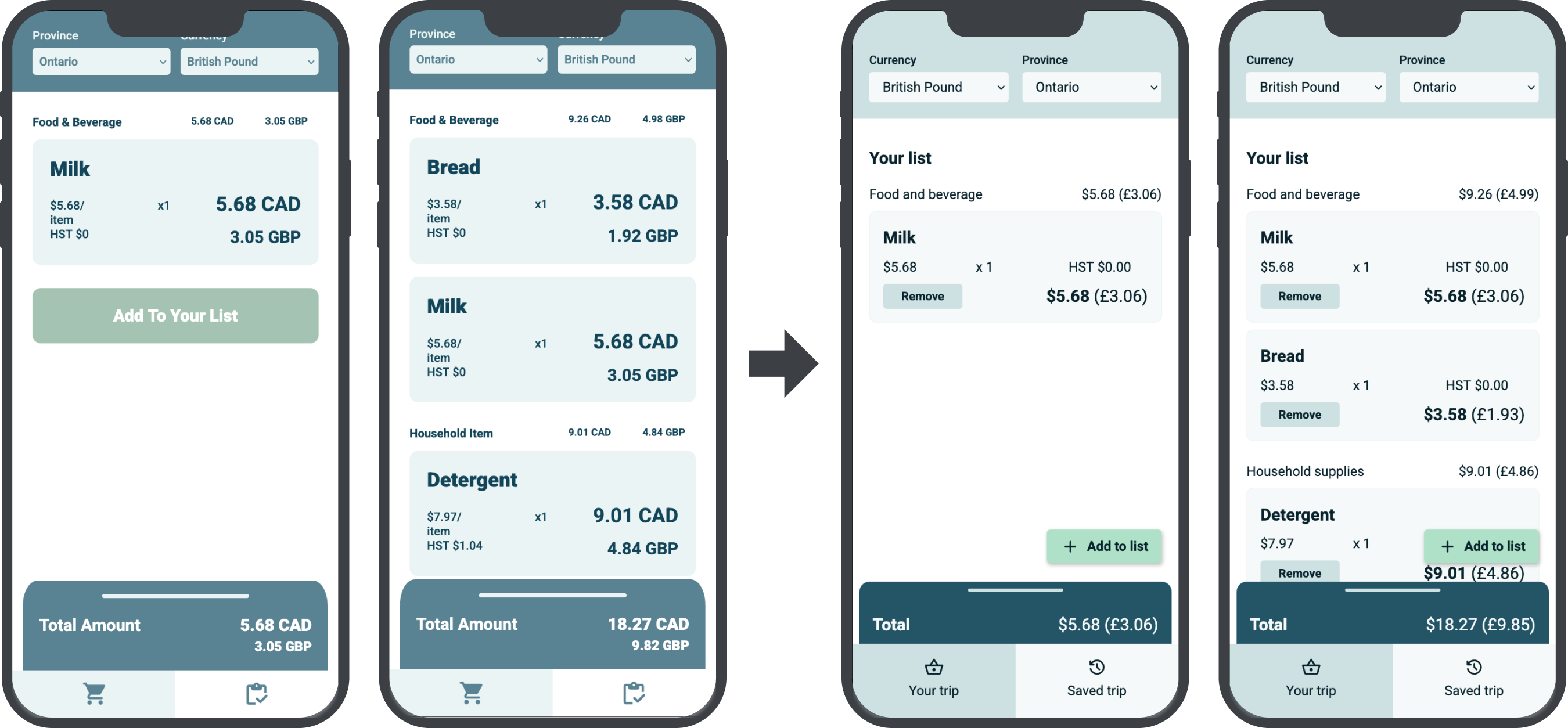
The fixed “Add to list” button means users don't have to scroll down to the bottom of the list to locate the button. I also added a simple delete function to remove items.
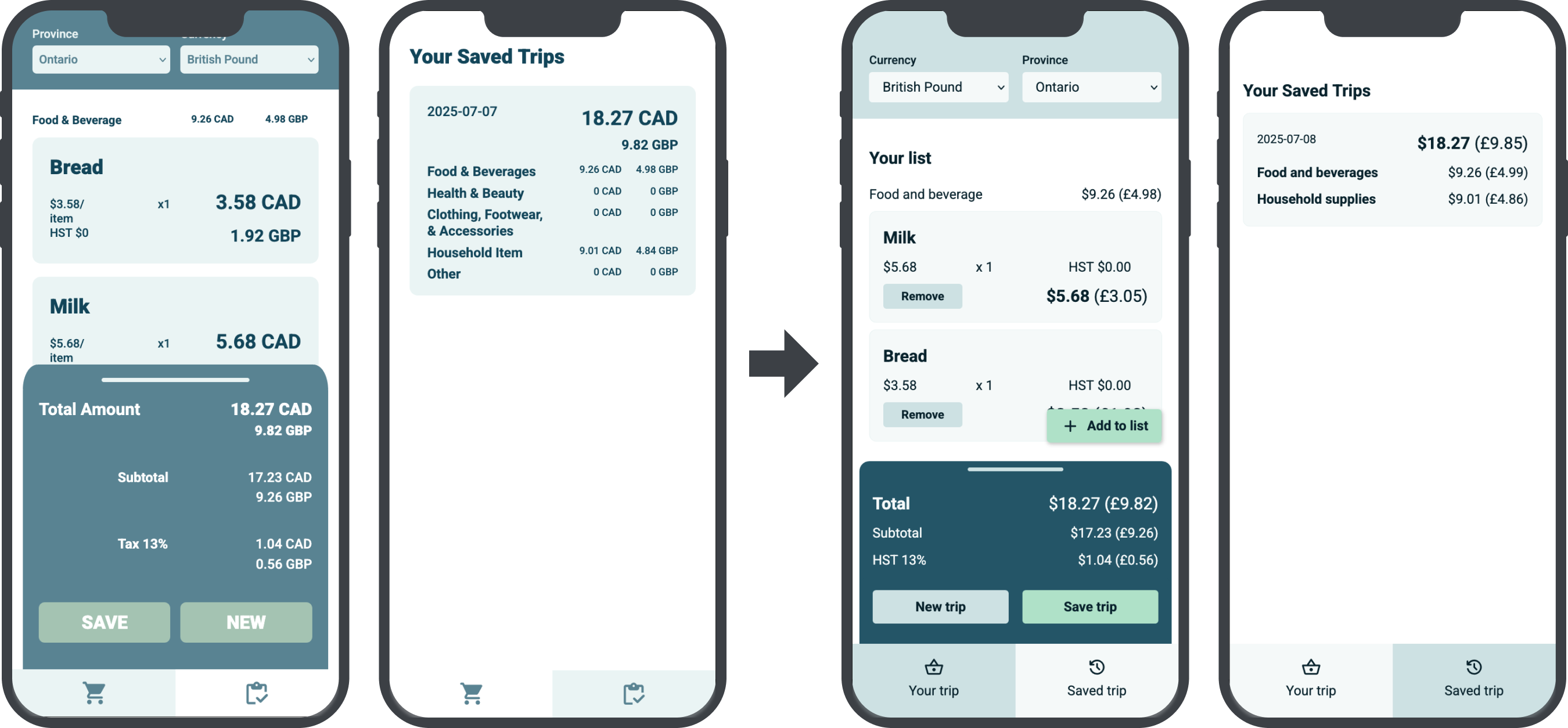
I simplified the layout of the summary area so it takes up less space and reduces confusion. In the “Saved” screen, only categories with information are displayed to remove clutter.
While the original prototype wasn't properly designed for a mobile app, it was better suited for mobile browsers.
Ideally, a mobile app would be more convenient and could leverage the device's hardware and operating system. However, the way that I developed the prototype makes it more suitable for a web app, and native hardware isn't necessary for the features that have been outlined. The small size of the original wireframes happens to be more suitable for mobile browsers.
View prototypes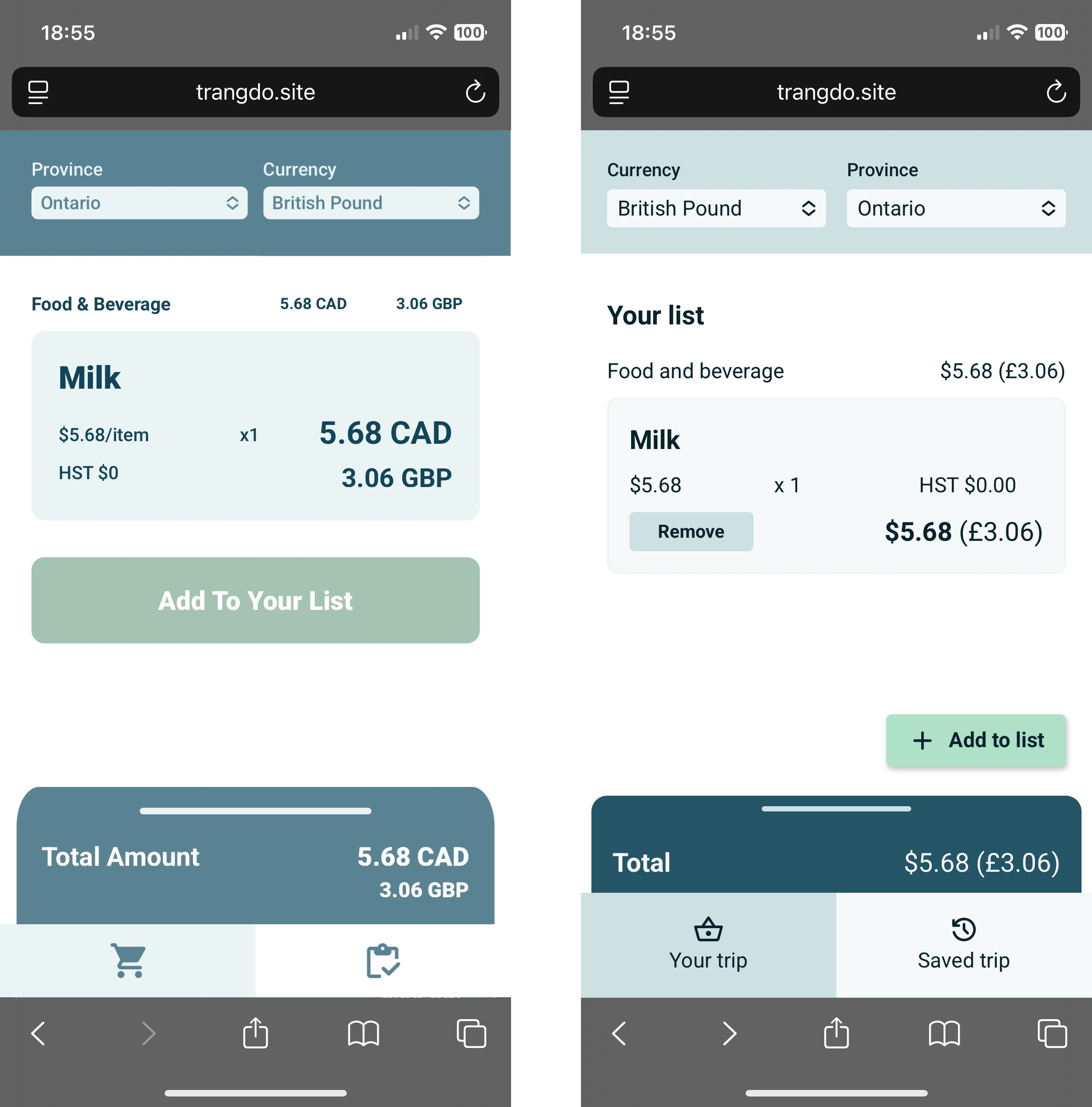
Next steps
There are improvements I could make to the prototype, such as adding geolocation to automatically detect the province the user is in, or a confirmation modal when the user taps on “Remove” on an item.
I want to open up the design and research portion of this project to further explore designing for accessibility. What would this app look like for older audiences? What if there's an option to interact with this app in another language? I also want to conduct additional user tests to ensure the app's accessibility and ease of use.