Designing a more mindful YouTube experience
YouTube's features that were initially designed for users' convenience have made it easier for the platform to maximize watch time and engagement, at the same time raising concerns about digital well-being. To better account for users' mental well-being, I reimagined the viewing experience to encourage more intentional actions and remind users to take breaks, while keeping the intrusions on their experience to a minimum.
Role
UX/UI Researcher and Designer
Tools
Figma
Duration
Jan – Apr 2024 (13 weeks)
Quick navigation
The challenge
YouTube features originally designed to give viewers an uninterrupted experience often increase screen time.
The solution
A redesigned experience to encourage more active querying for content and monitoring watch time.
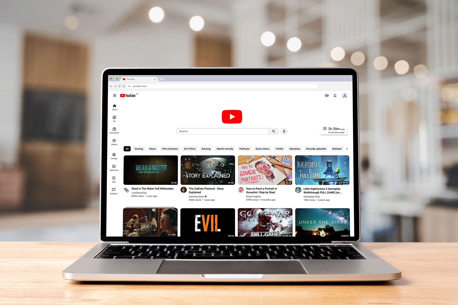
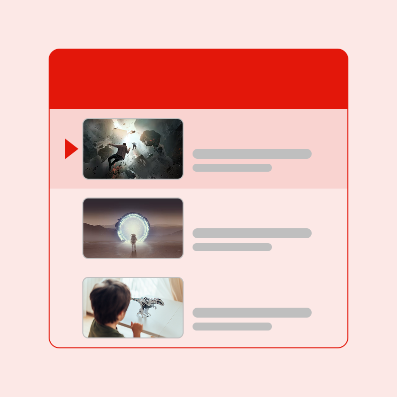
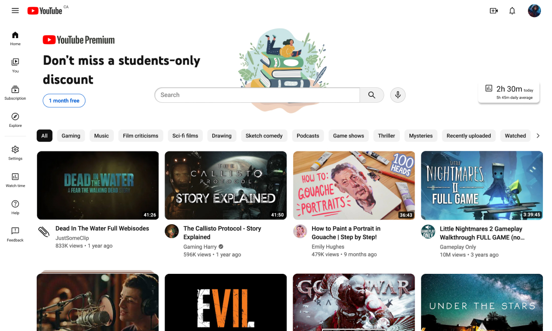
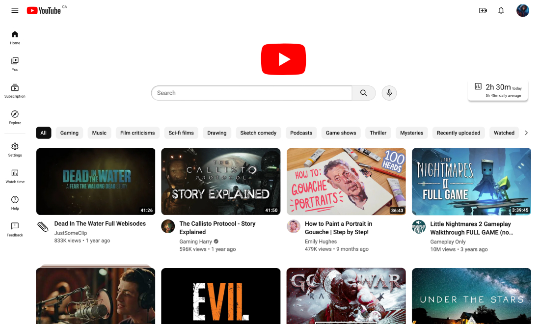
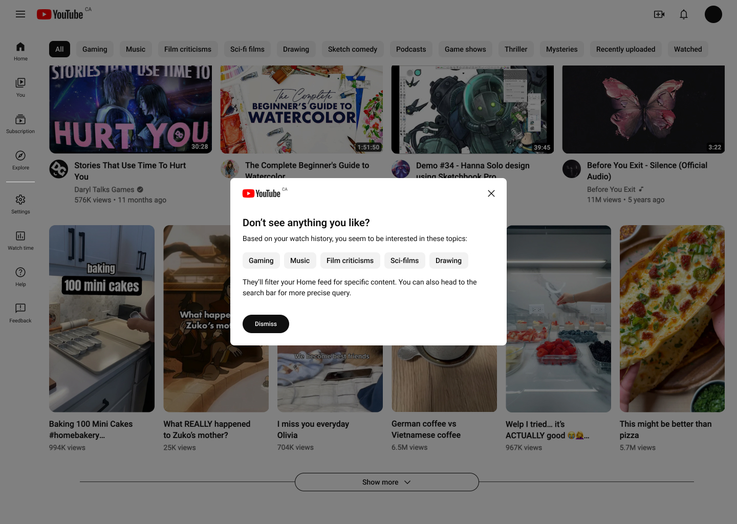
A redesigned Home feed puts more focus on the search bar and encourages more active queries for content. The user is shown a finite number of content and actively loads more videos.
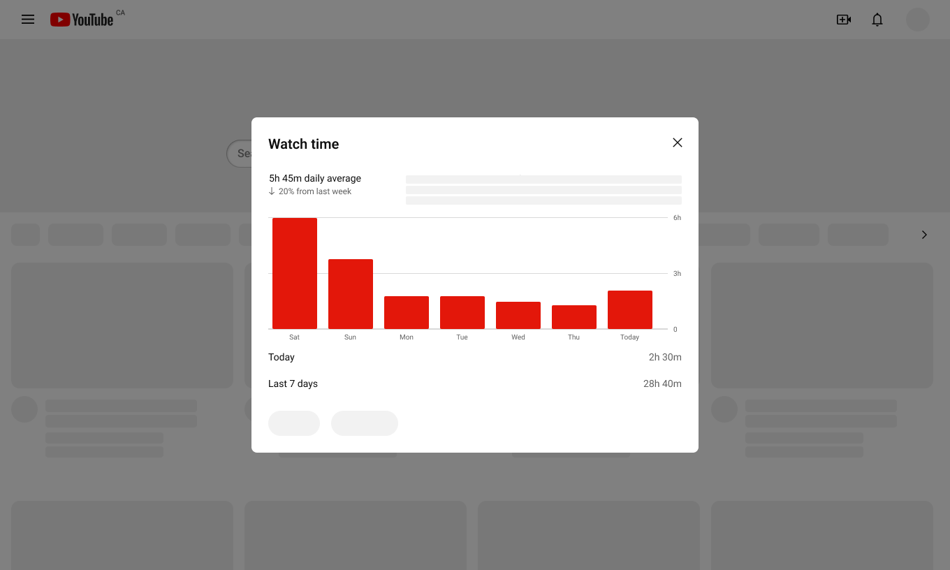
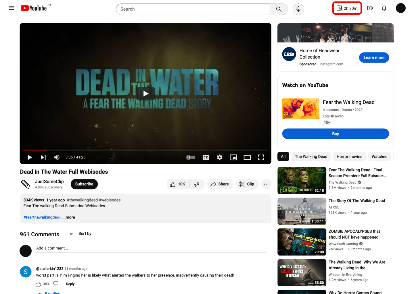
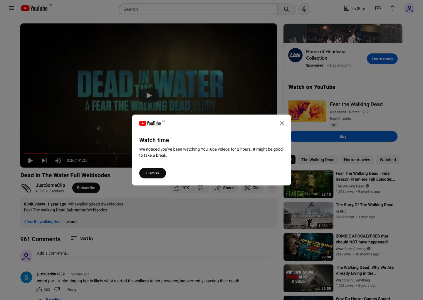
Time tracking and break reminder features, only available on the YouTube app, were added to the redesigned web platform, with periodic alerts of long continuous usage to allow users to monitor their usage and remember to take breaks.
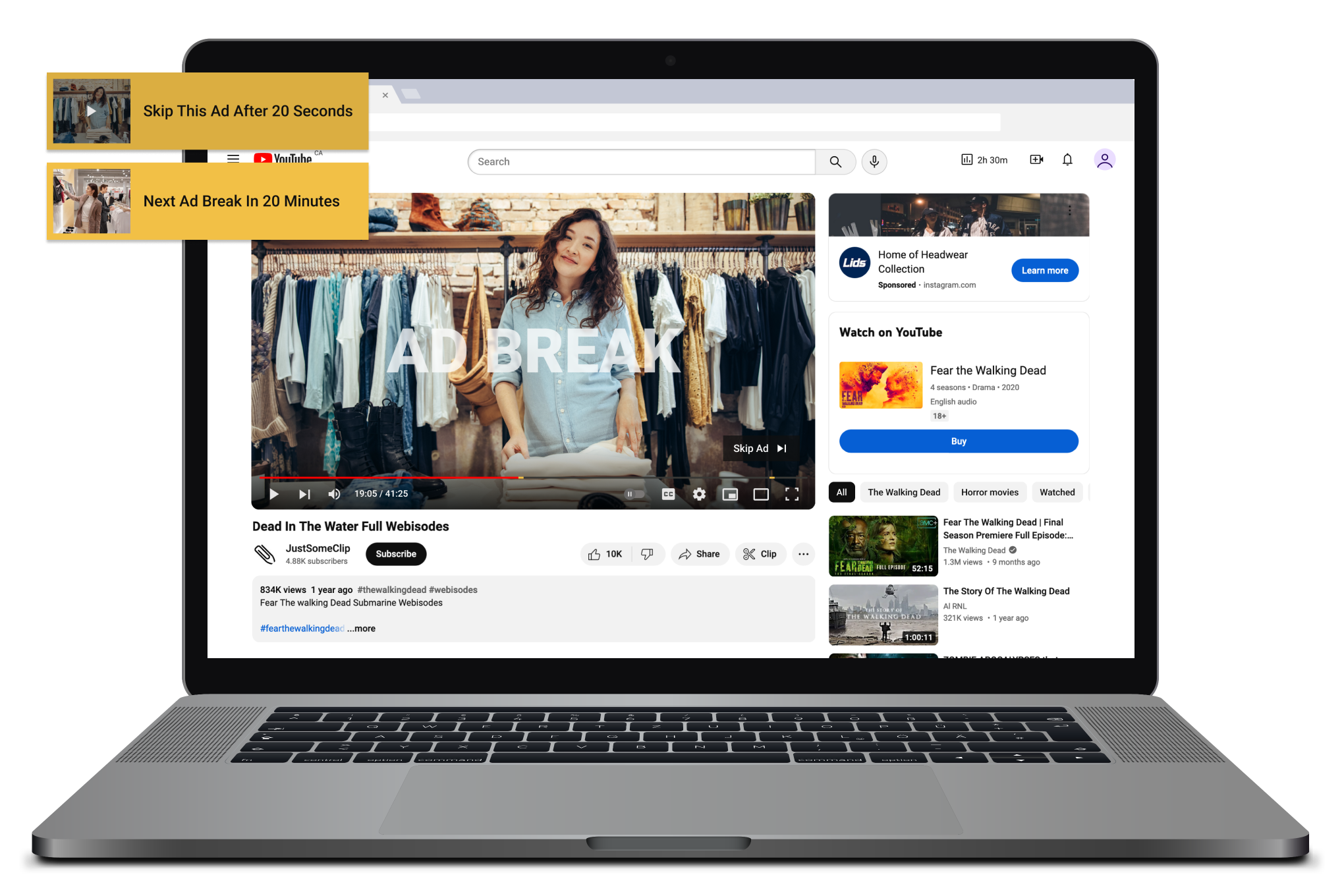
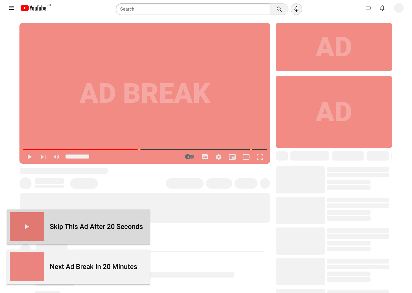
Balanced ad breaks serve as screen time breaks. Setting ad frequency according to the 20-20-20 rule can encourage the user to take a short break from the screen while ensuring revenue for creators and the platform.
The challenge
How might we design the viewing experience on YouTube to reduce distractions and encourage mindful usage with minimal intrusion?
YouTube features designed to give viewers an uninterrupted experience often increase screen time. Videos with attention-grabbing titles and thumbnails perform well, despite fragmenting viewers' attention.
Fragmented attention
Creators are encouraged to produce sensational and attention-grabbing content which distracts viewers and grabs their attention.
Little-known time-tracking
Break reminders and watch time reports are only available on the app, despite desktop users having higher screen time (Semrush).
Increased screen time
Features such as autoplay and queueing, in combination with the algorithm, facilitate binges and increase watch time.
Research
Understanding how YouTube operates
The primary parties of YouTube's digital ecosystem are the viewers, the creators, and the advertisers. YouTube reaches these parties through its browser platform, mobile and TV apps, and monitors and regulates activities between them (The YouTube Formula).
Viewers explore and access content based on their goals and interests.
Creators make and upload videos for viewers to access.
Advertisers pay YouTube to display their advertisements and partner with creators to promote their products.
YouTube operates on an ad-driven model
YouTube's Freemium experience generates revenue through advertisements on the platform. This ensures the viewers have free access to content, the creators receive compensation for their works, and the platform makes enough profit to keep running. Viewers can pay for a subscription to remove ads and watch uninterrupted.
YouTube operates on an attention-driven model
The longer viewers stay on the platform, the more content and advertisements they access, and the more YouTube benefits. The constant stream of content keeps viewers on the platform and increases watch time and revenue for YouTube, but at the expense of fragmenting viewers' attention and high social media usage.
Define
A more mindful viewing experience
This project aims to redesign the current experience to be more cognizant of viewers' attention by encouraging more intentional actions. To create a more mindful experience, changes would be made to the ways viewers interact with advertisements and regular content on the platform.
Highlight the values and benefits YouTube currently provides instead of competing with other social media platforms.
Reduce mindless scrolling and encourage users to be more intentional with their actions without compromising ease of use.
Reduce screen time and encourage viewers to take breaks, while ensuring creators receive engagement and compensation.
Ad placements that balance mental well-being and revenue
Ads following the 20-20-20 rule (a 20-second break for every 20 minutes of screen time) can serve as shortened commercial breaks to reduce long binges and eyestrain. With the ads more reasonably spaced out, viewers would be more tolerant of longer unskippable ads, in turn ensuring revenue.
Design changes to facilitate mindful usage
YouTube still benefits if some users spend less time on the platform. Its entertainment and education values, as well as the long-standing brand name, are competitive factors that many emerging platforms can't benefit from. There are small changes that can reduce distractions and encourage users to manage their screen time without significantly altering how the platform works.
Design
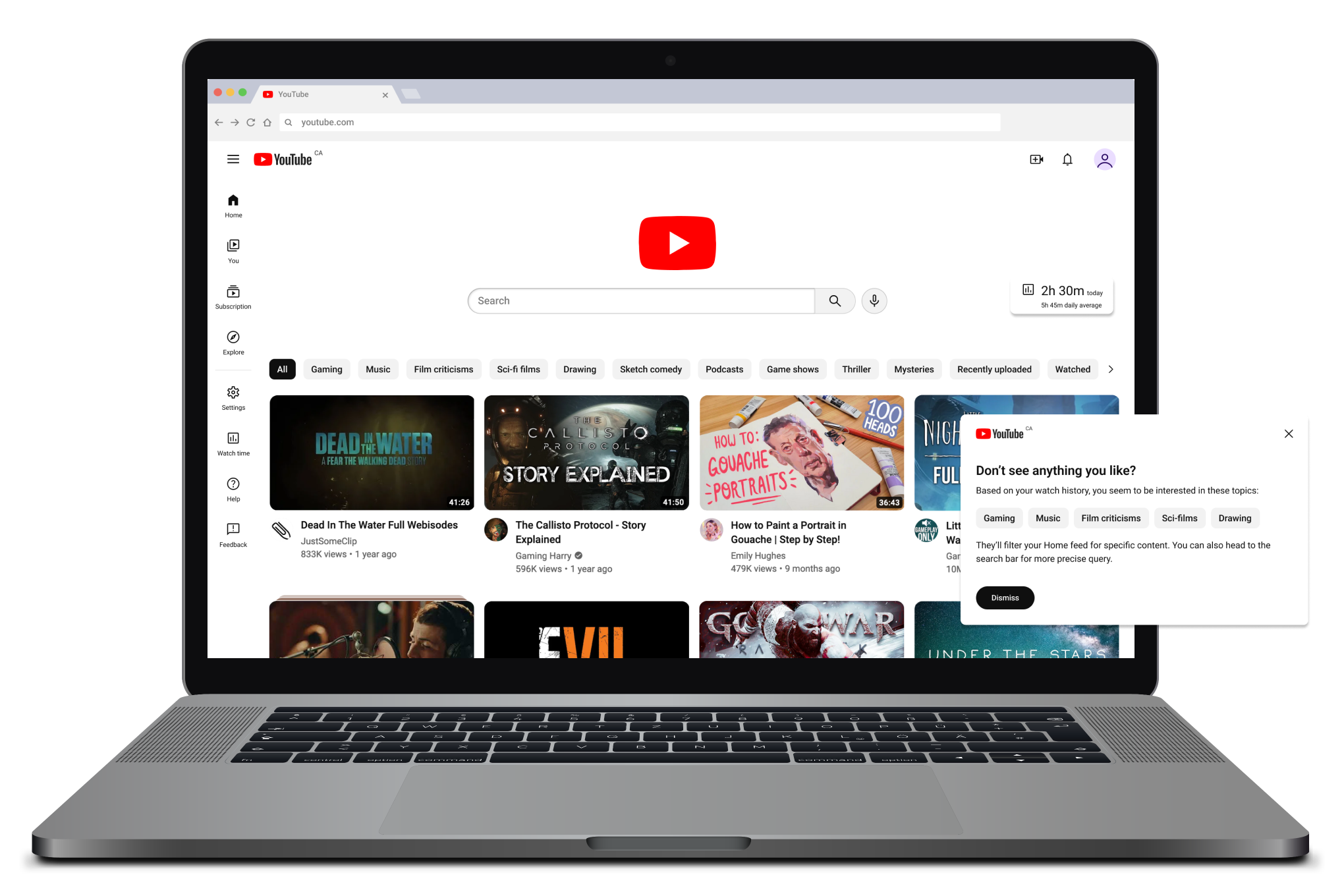
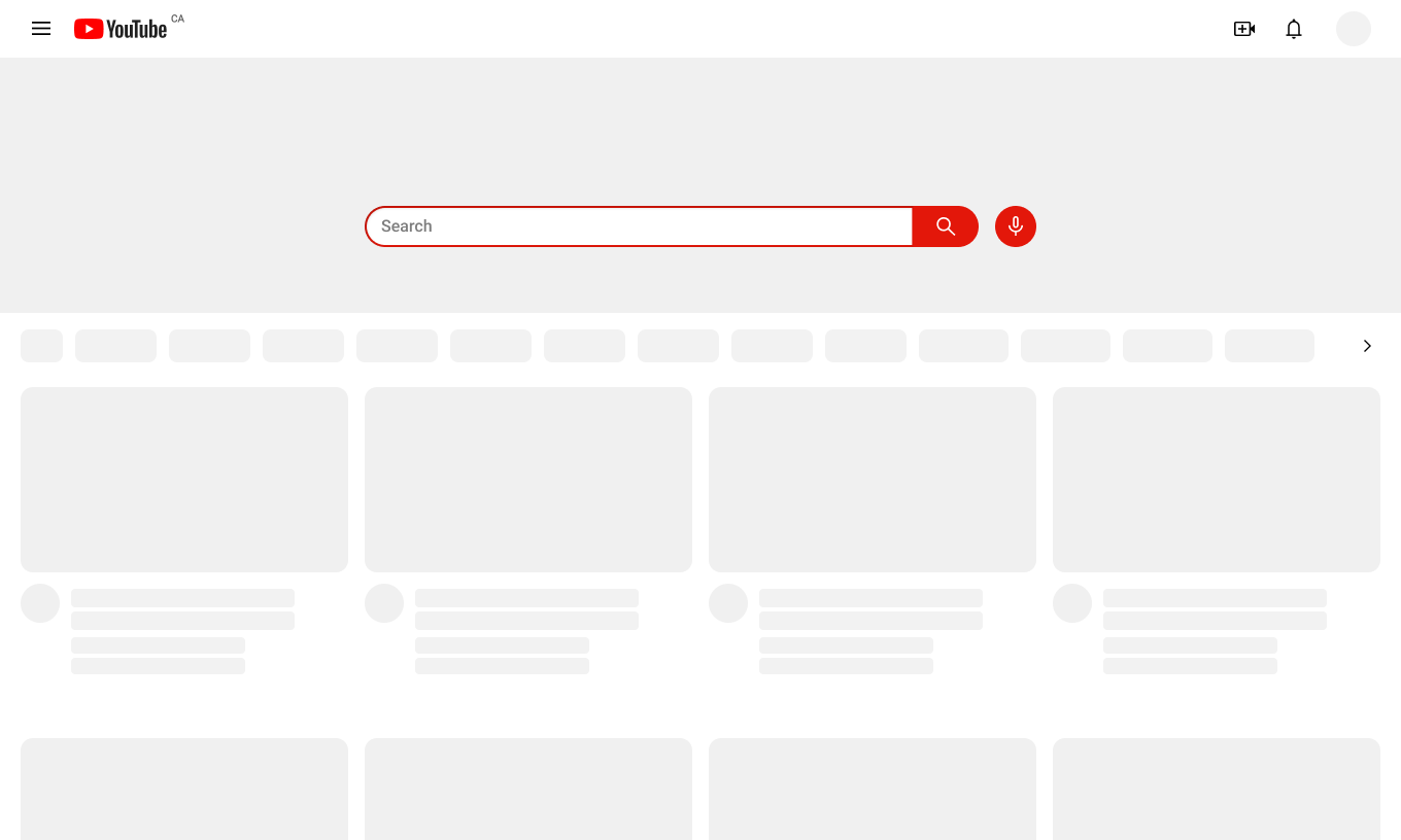
Placing more emphasis on the search bar
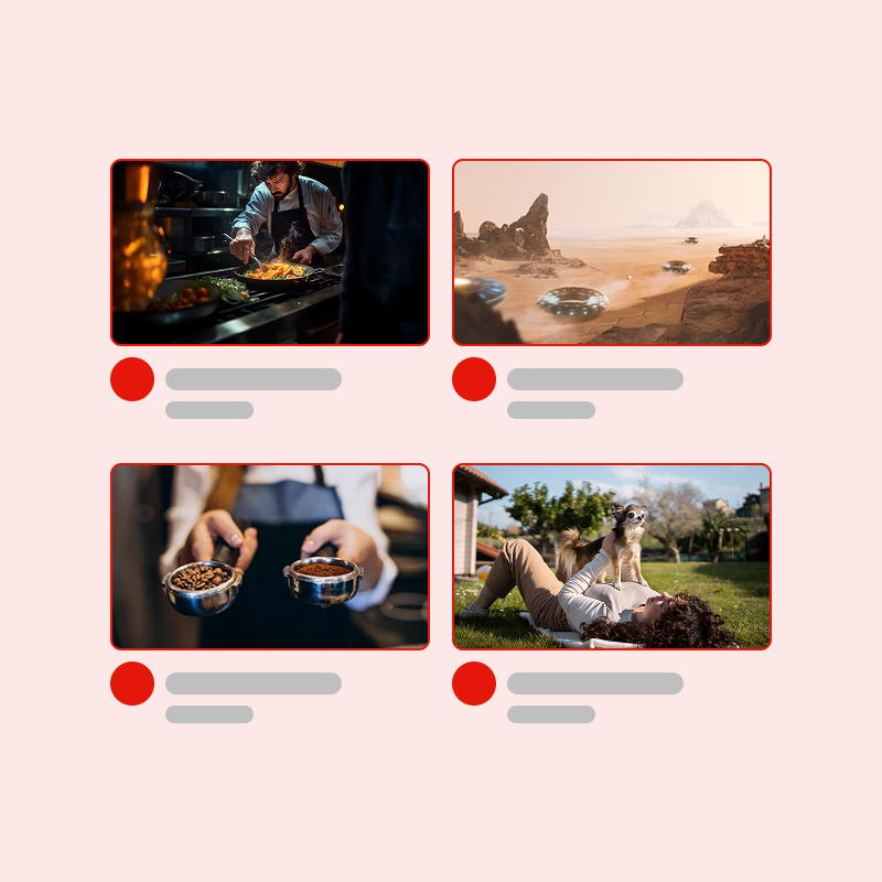
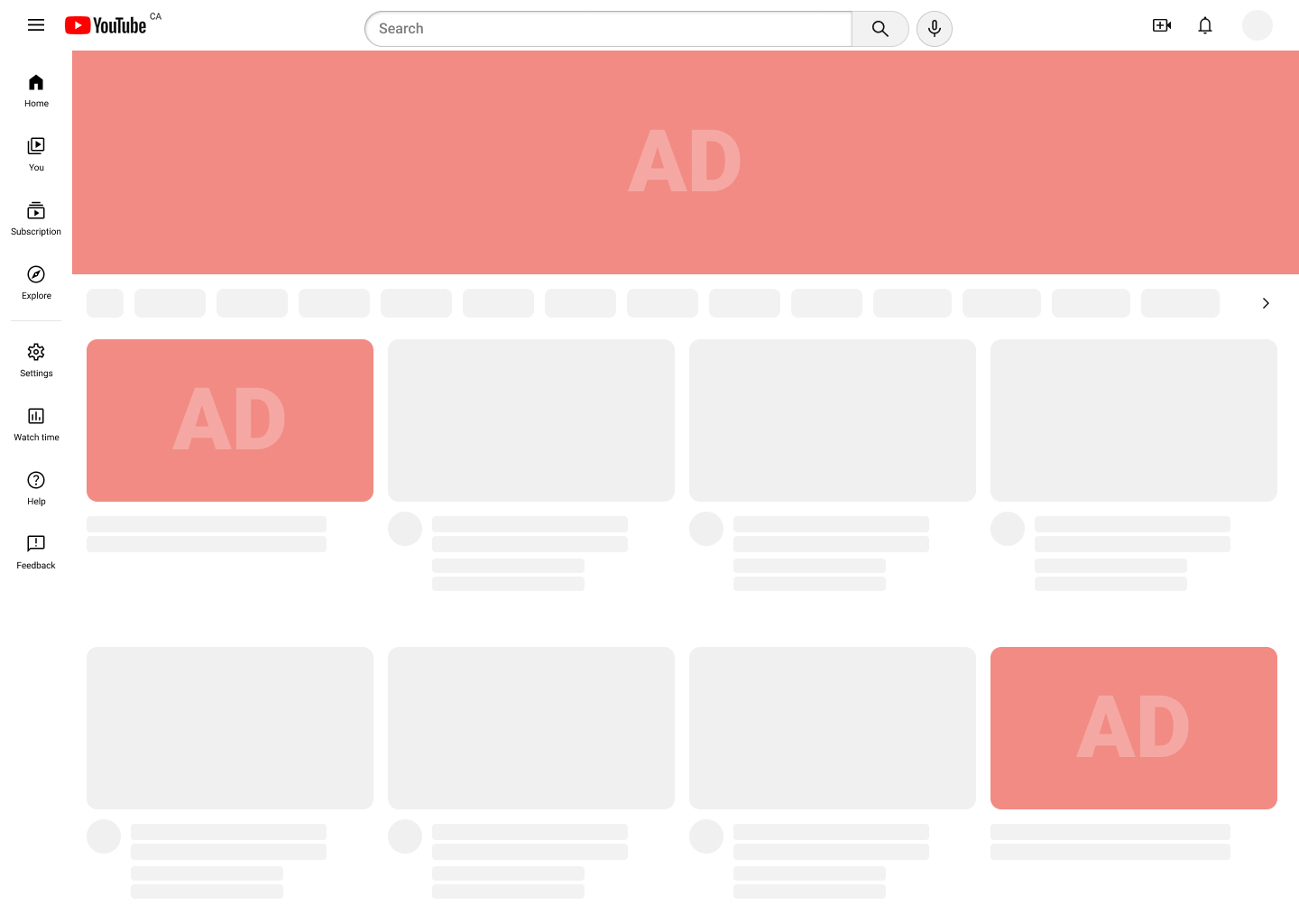
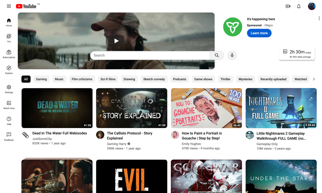
The additional emphasis on the search bar and filter tags encourages viewers to search for what they want, rather than passively exploring their recommendations. Since this space is often used for masthead ads, I mocked up three advertisement experiences for user testing.
While the prominent search bar is more likely to remind them to search for something, many viewers would continue to browse. The large advertisement was found to be too distracting and was ultimately removed to create a less intrusive experience.
Unclear
Too distracting
Least intrusive
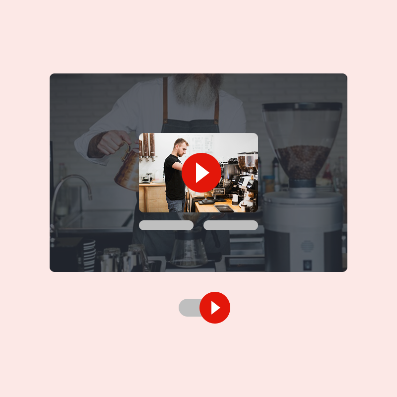
Removing infinite scroll
A finite number of content is displayed at a time, and the user can click on “Show more” to load more videos. If users are on the Home feed, they will be given the option to actively search and filter for results after multiple clicks. User testing found that these changes were not intrusive to the user experience; users didn't mind an extra click to load, filter, or dismiss content.
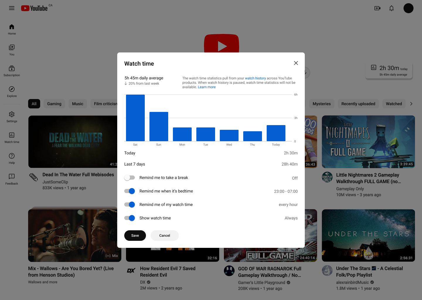
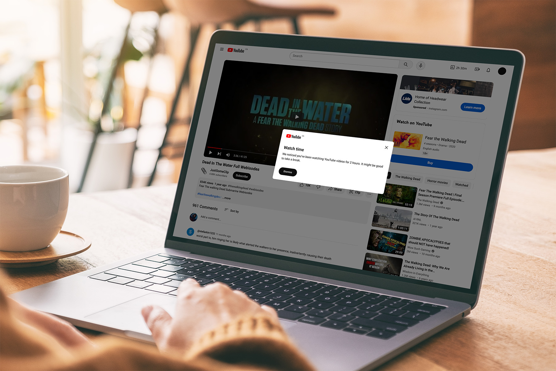
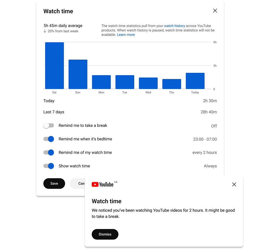
Adding time tracking and break reminder
I used the "Time watched" feature in the YouTube app as the foundation to design a time tracking feature and watch time reports for the website. Having an active timer displayed onscreen can be distressing, so the time watched will only update when the user clicks on a new video. A pop-up alerts viewers of long usage periods.

Reflection
01
It was challenging to identify a direction to encourage users to pause their YouTube activities while ensuring revenue generation. With more time and business understanding, I would have liked to approach this project from a different angle than just monitoring screen usage.
02
The next step is iterating the long-usage pop-ups to be less repetitive, more engaging, and more customizable, as well as scaling the proposed changes to suit all devices and conducting further user testing to capture a wide range of experiences.