Designing a book cover for NOS4R2
Overview
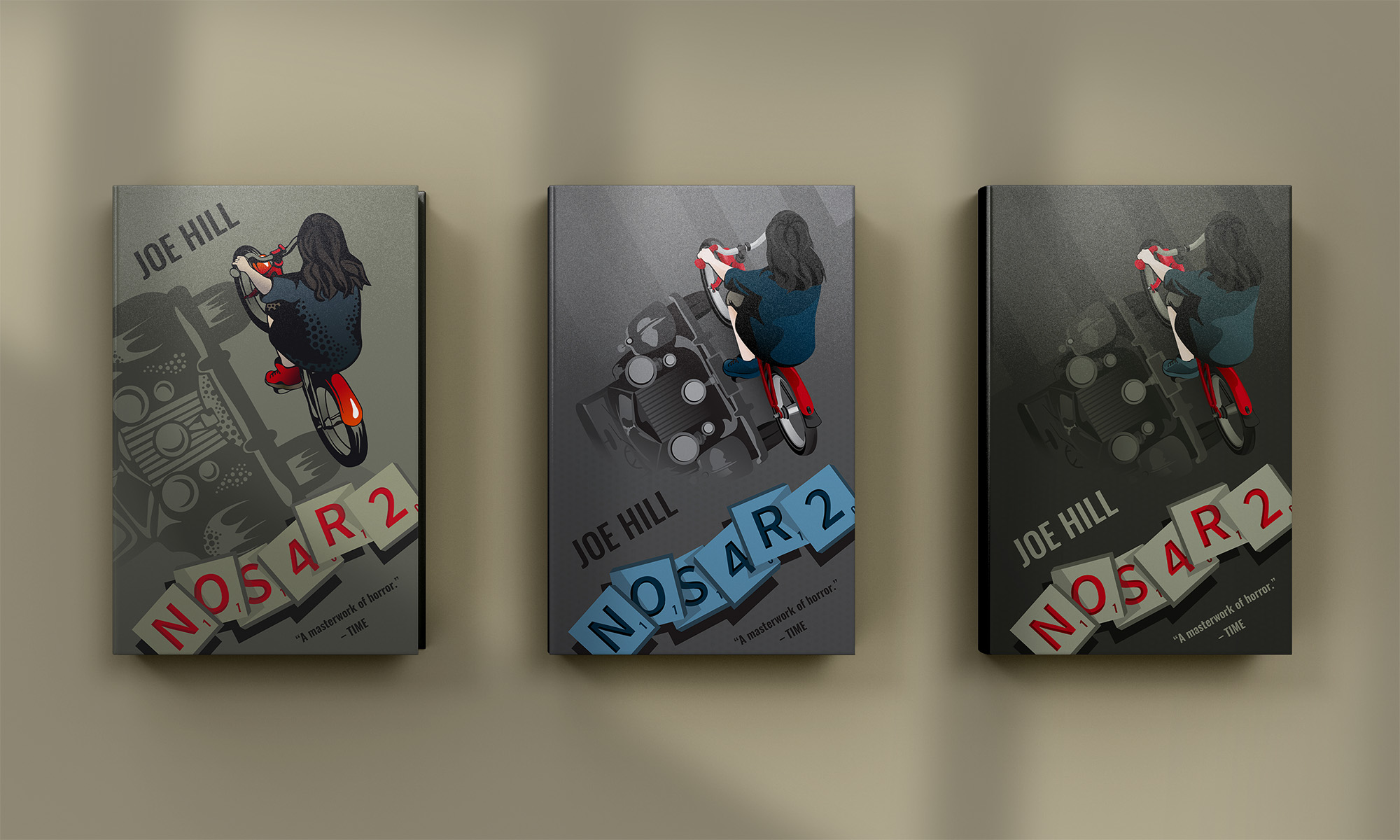
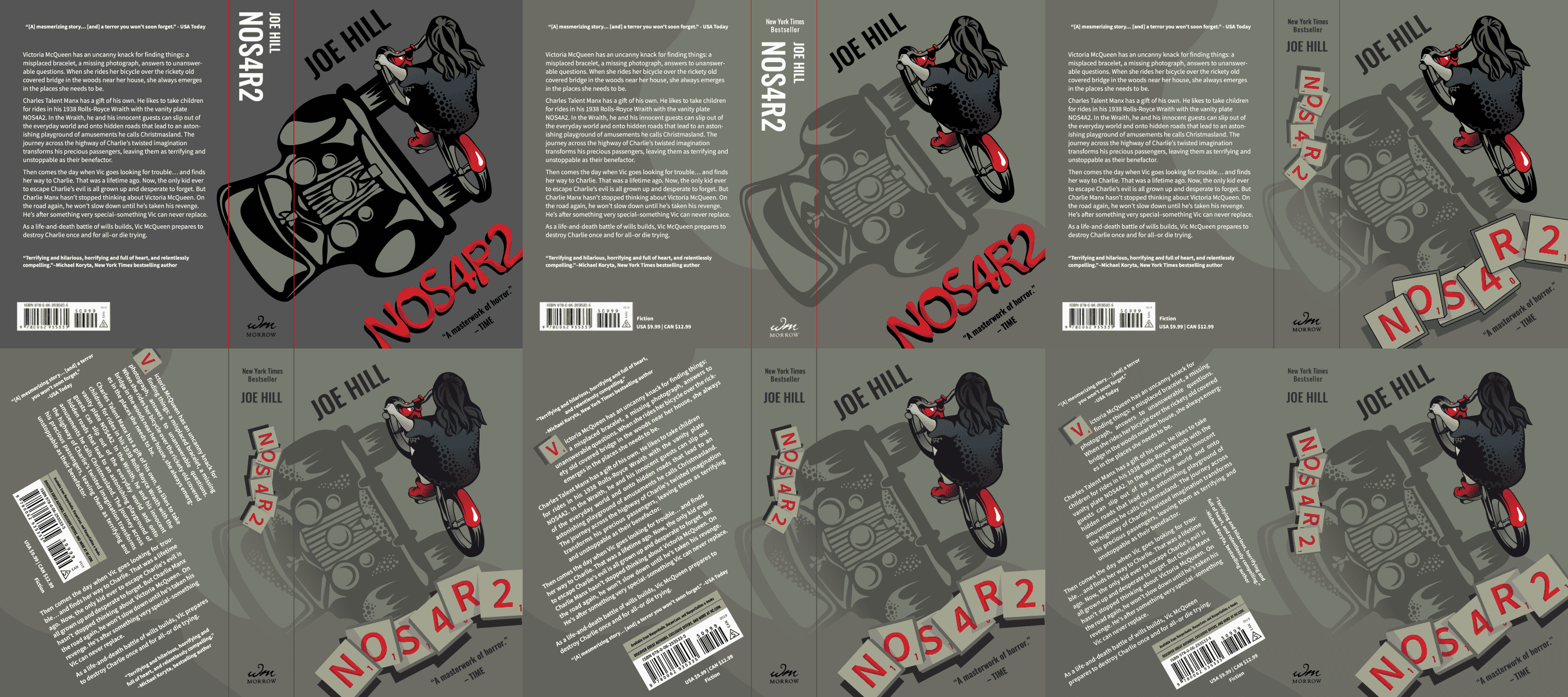
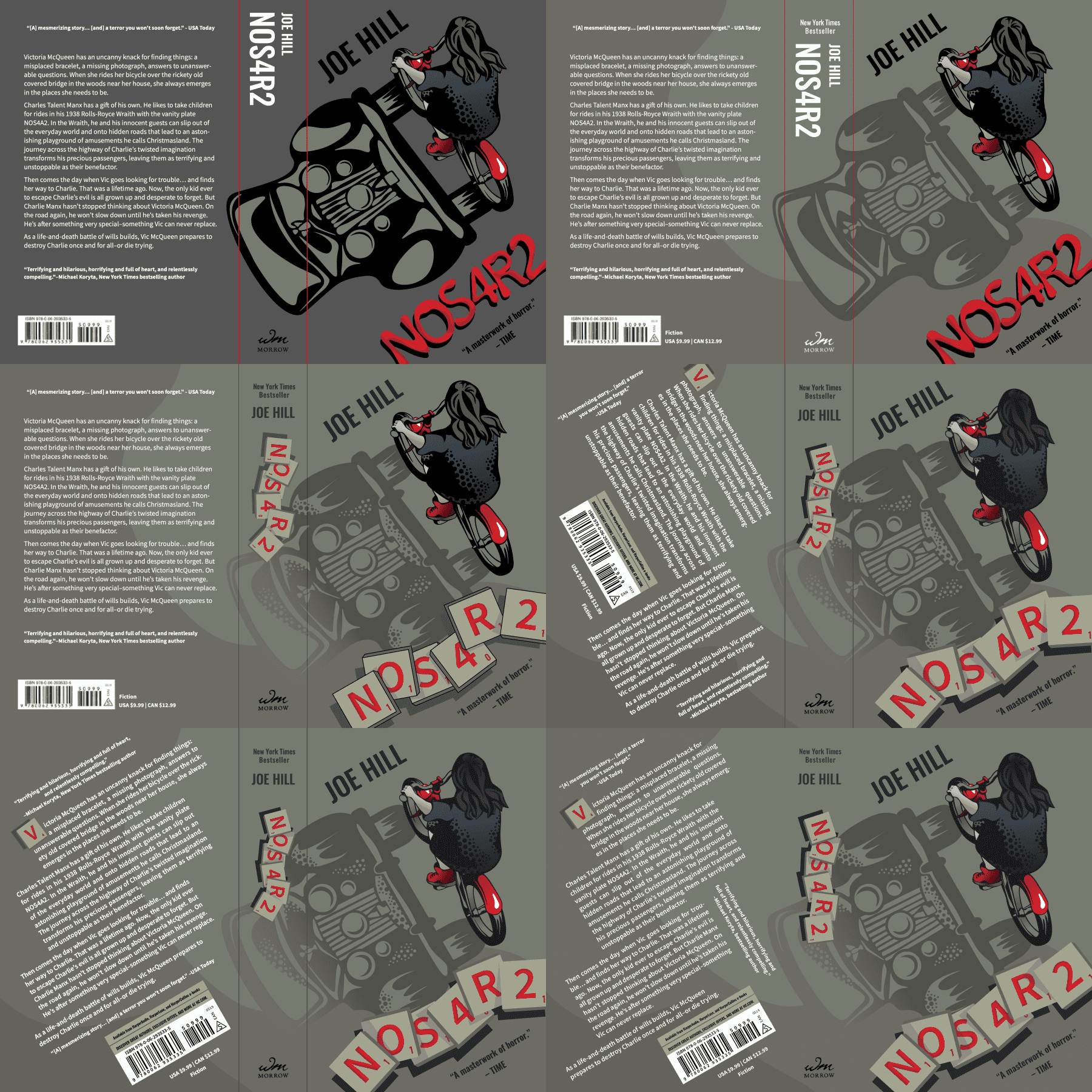
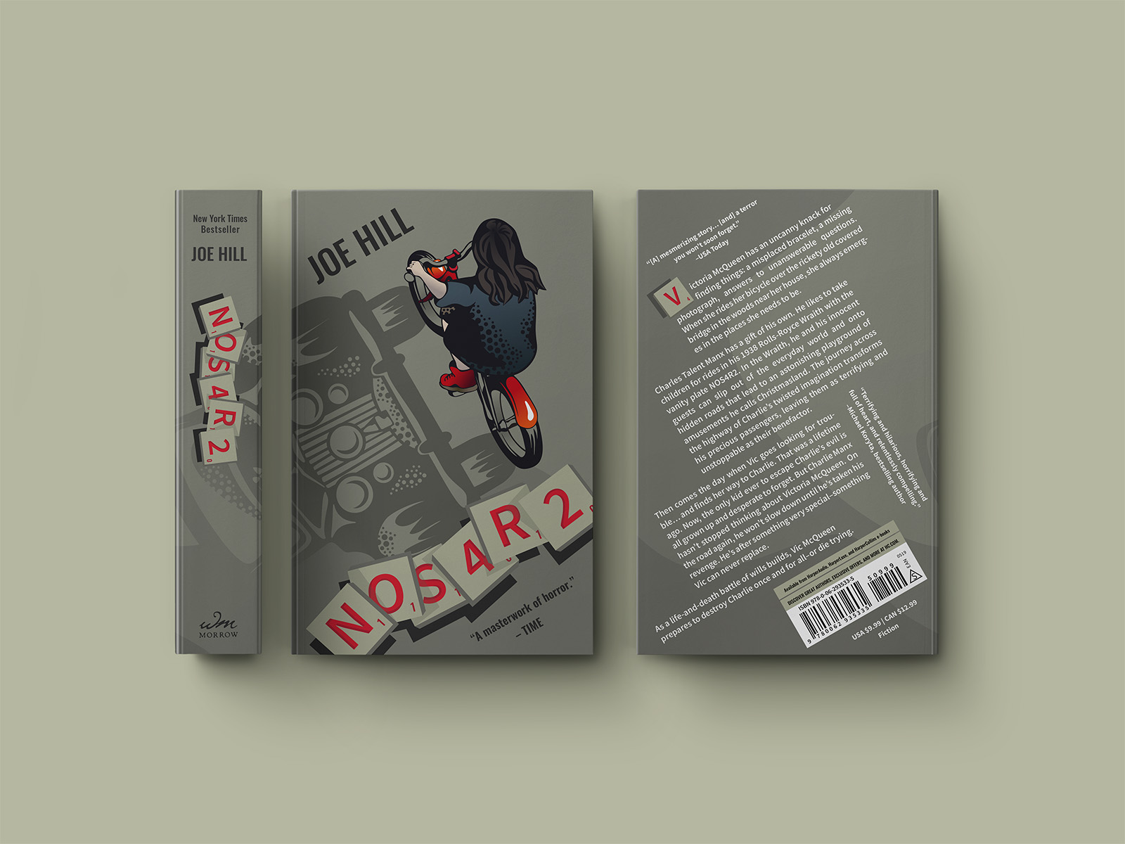
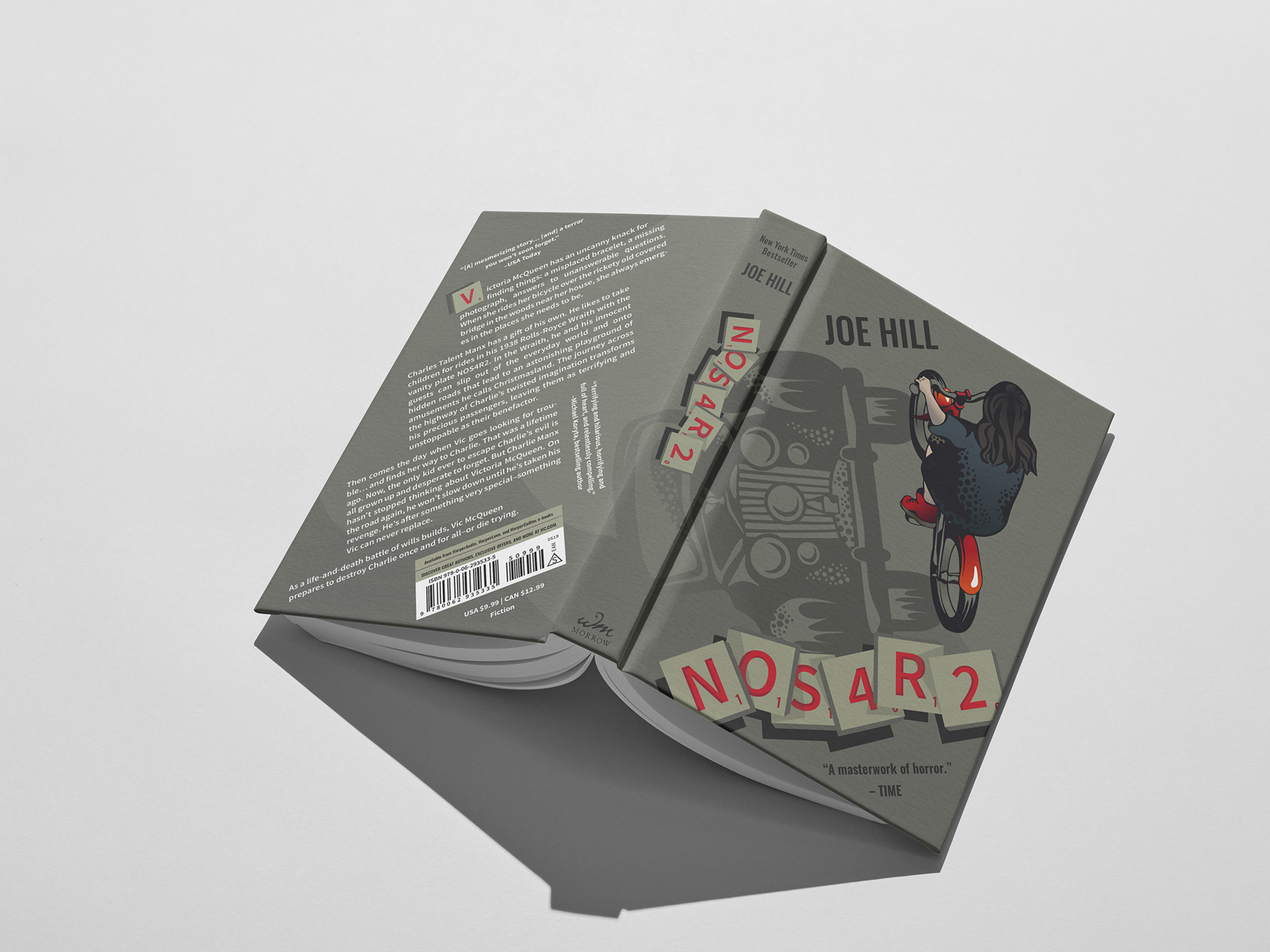
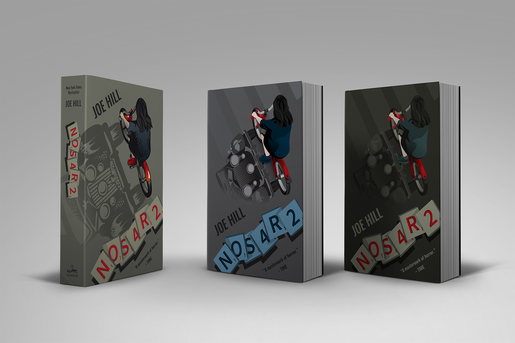
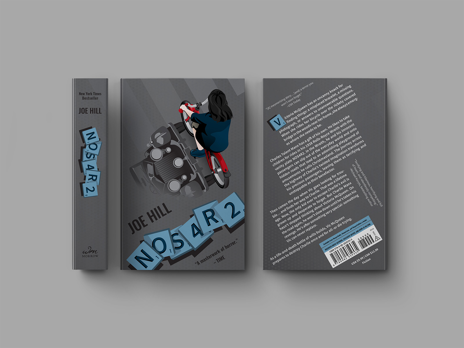
This is an independent conceptual book cover design for Joe Hill's horror novel NOS4R2. The image of the car as the shadow alludes to the inability to accept reality, signifying something being haunted and not what it appears to be. The Scrabble tiles, an in-story access to the supernatural, represent a bridge between the readers and the fictional world.
Role
Visual Designer
Tools
Pen & paper, Sketchbook, Adobe Illustrator, Photoshop, Cinema 4D, Meta Spark AR
Timeline
First design: Sep – Oct 2022 (4 weeks)
AR effect: Oct – Nov 2022 (5 weeks)
The novel
What is NOS4R2 about?
NOS4R2 (or NOS4A2) follows Victoria McQueen, a woman with the supernatural ability to find missing things. The novel blends psychological horror with dark fantasy to explore the corruption of innocence, the power of imagination, trauma and self-destruction, among other themes.
I wanted to highlight these themes through the story's fantastical world and the objects that connect the characters to their abilities—Vic's bike, a 1938 Rolls-Royce Wraith, and Scrabble tiles.
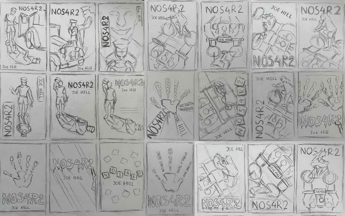
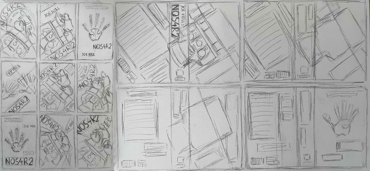
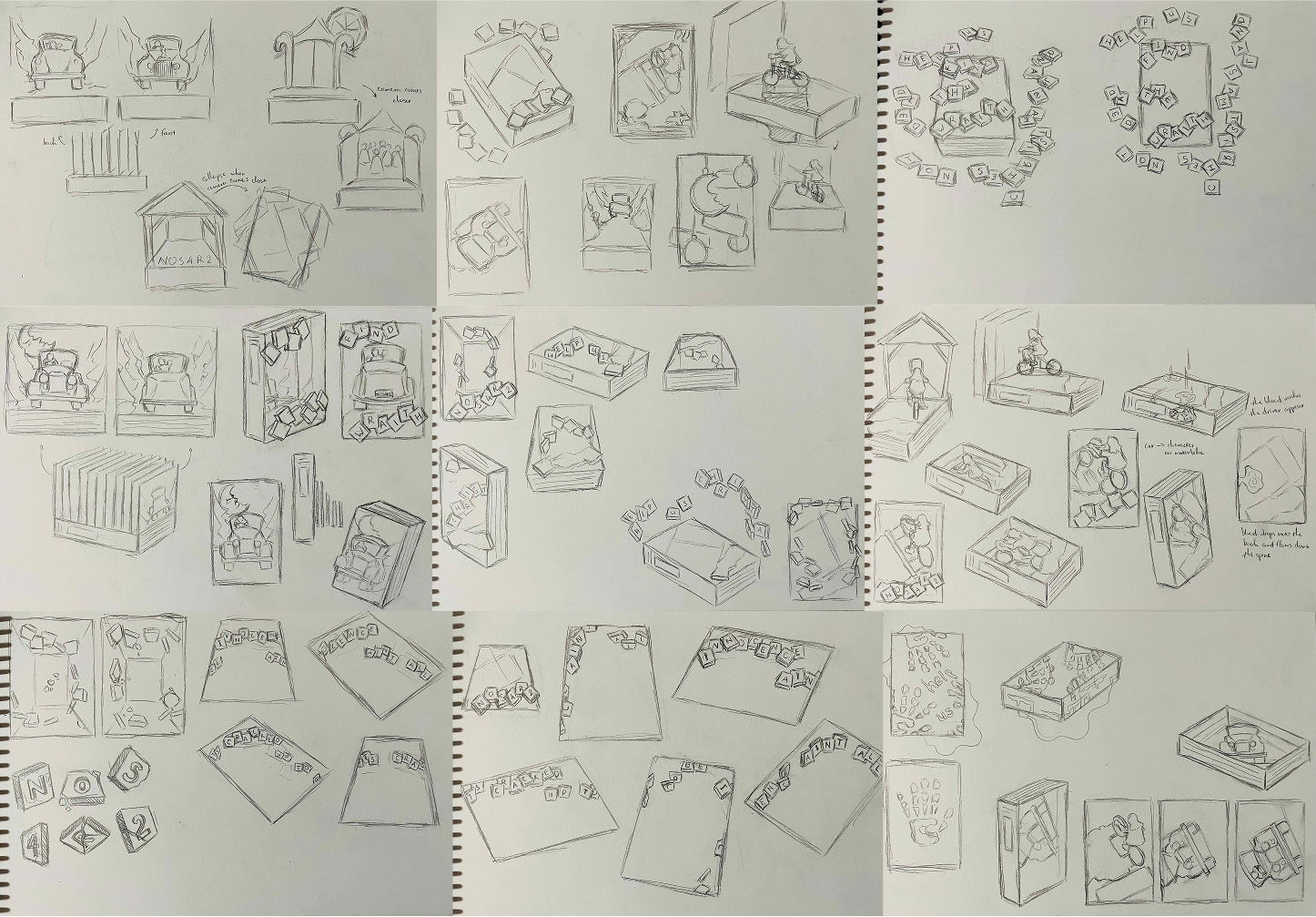
Ideation
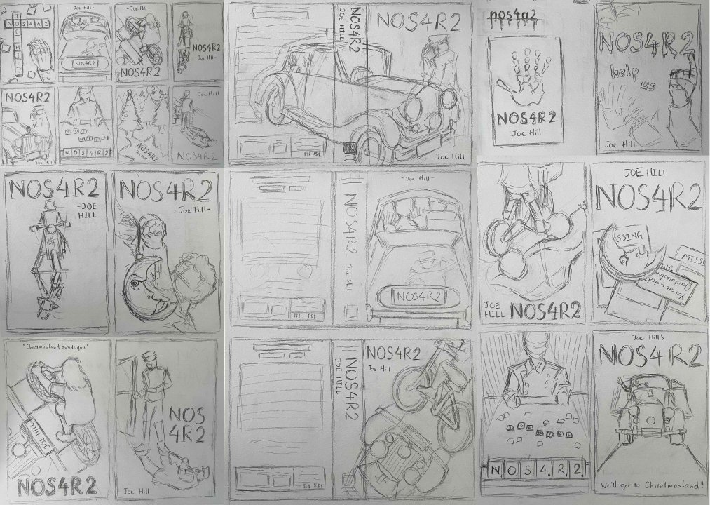
Experimenting with imageries and styles to highlight the dark supernatural world
The sketches featuring the characters and their shadows were more interesting and suitable for the story. The concept with the main character haunted by the car was ultimately more distinctive and conveyed the story better. Based on the story, I wanted the design to have a comic book feel. The art style and colour scheme were inspired by the animated movie ”Spider-Man: Into the Spider-Verse”, the comic book series ”Sin City” by Frank Miller, and ”Hellboy” by Mike Mignola.
Design
Refining the concept in Illustrator
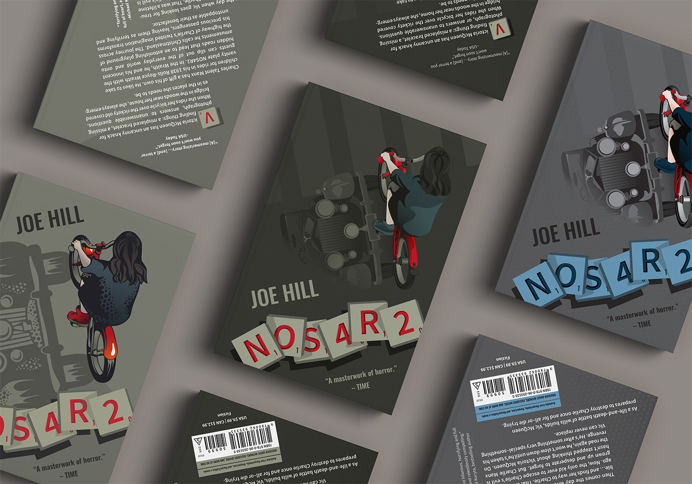
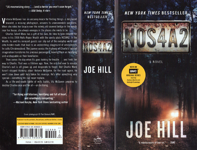
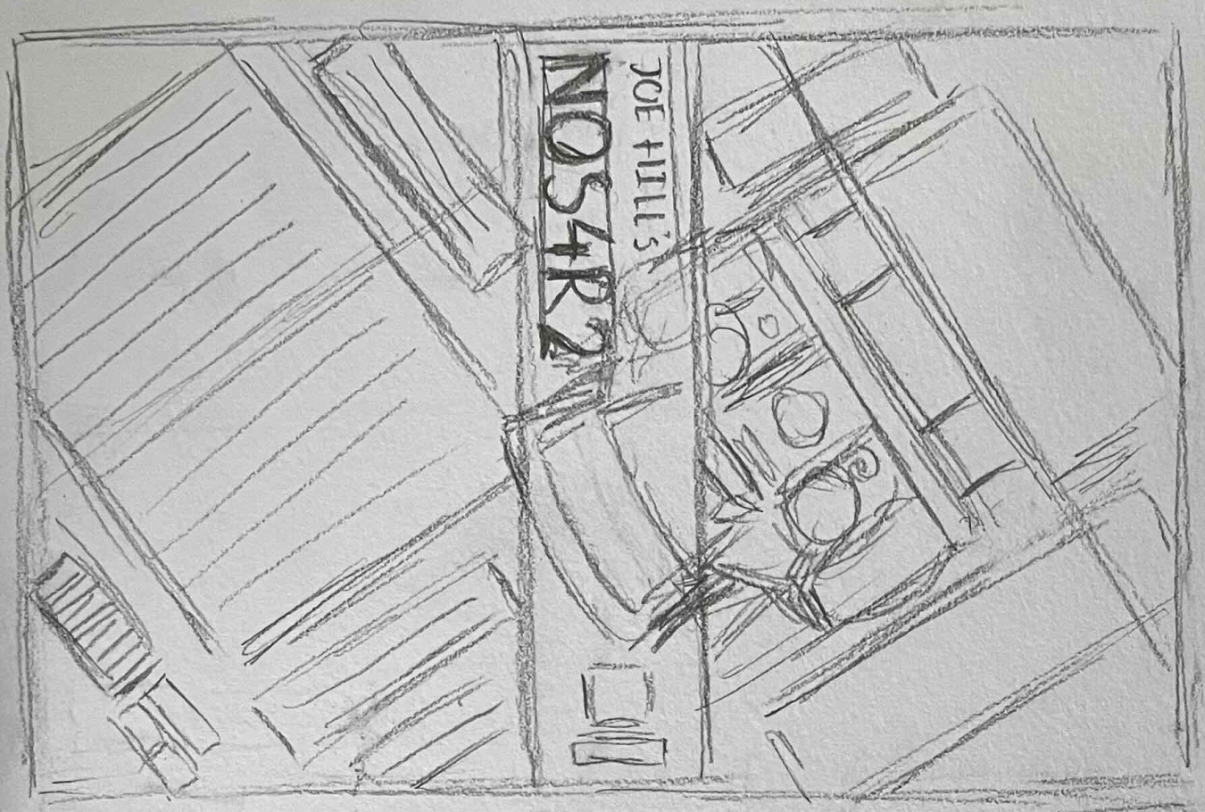
The vector illustration for the character was drawn referencing a stock image, then adjusted according to the digital sketch. Francesco Francavilla's tribute cover of the book was used as the main reference for the car. Based on feedback, I switched out the initial blood-like title with the Scrabble tiles, which have a stronger connection to the story. The direction of the back cover's text was aligned with the diagonal direction of the front cover's illustration.
Hex
RGB
#3B4954
59, 73, 84
Hex
RGB
#231F20
35, 31, 32
Hex
RGB
#50514A
80, 81, 74
Hex
RGB
#A3A58C
163, 165, 140
Hex
RGB
#BE1E2D
190, 30, 45
Redesign
Revisiting the cover design
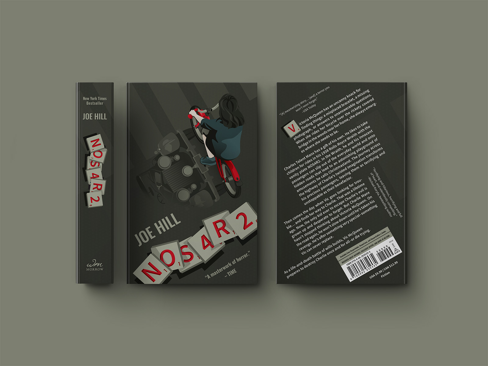
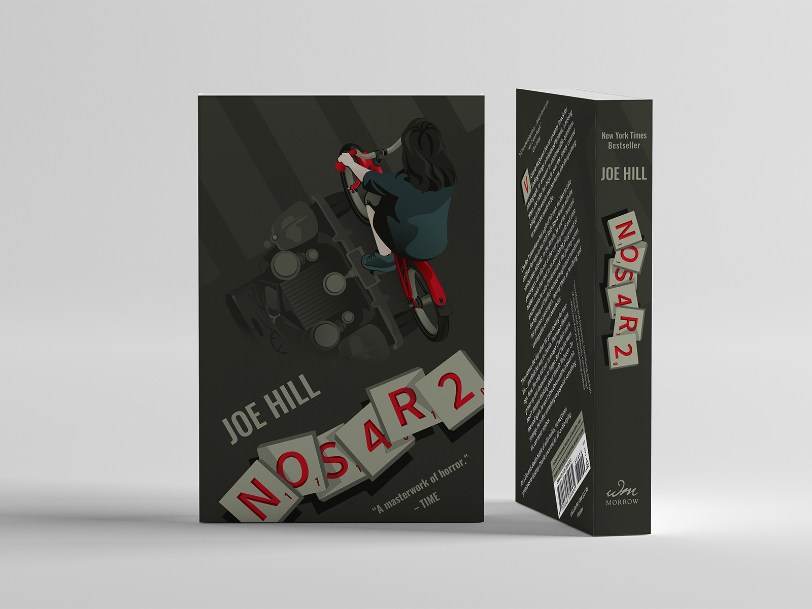
While the first iteration was completed in 2022, I wanted to adjust some details I wasn't entirely happy with, and I decided to make another iteration a year later. I like the first iteration—it has an interesting concept and layout. I was learning more about vector illustrations and wanted to redo the character illustration. I revisited this cover design once again at the start of 2025.
Cleaner illustration, different colour scheme
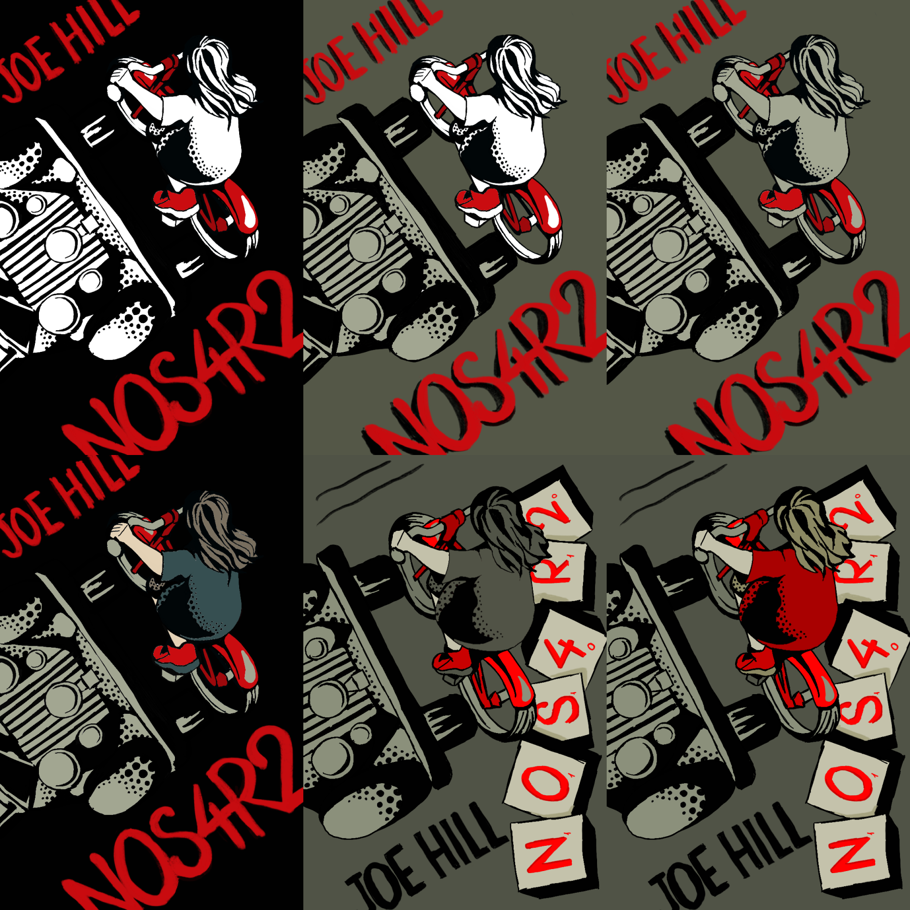
I used the same sketch as the foundation and kept the overall layout. The illustrations were drawn more closely to their references. They have less of a comic book art style, but extend across the cover more subtly. I experimented with a colder scheme with red as the emphasis, so the blue Scrabble tiles would work more harmoniously with the colours of the main character.
Reverting to the first colour scheme
I wanted to experiment with the first colour scheme since it has a more distinctive colour scheme that ties into the story better. I had received feedback that the car was too harsh in the second iteration to be recognized as a shadow, so I wanted to take this opportunity to make it subtler. I also corrected the type of bike portrayed to resemble a Raleigh Tuff Burner, Vic's childhood bike, which is a small detail that is representative of her daredevil character.
Hex
RGB
#364F50
54 79, 80
Hex
RGB
#141511
20, 21, 17
Hex
RGB
#4D4F44
77, 79, 68
Hex
RGB
#A2A691
162, 166, 145
Hex
RGB
#C1111F
193, 17, 31
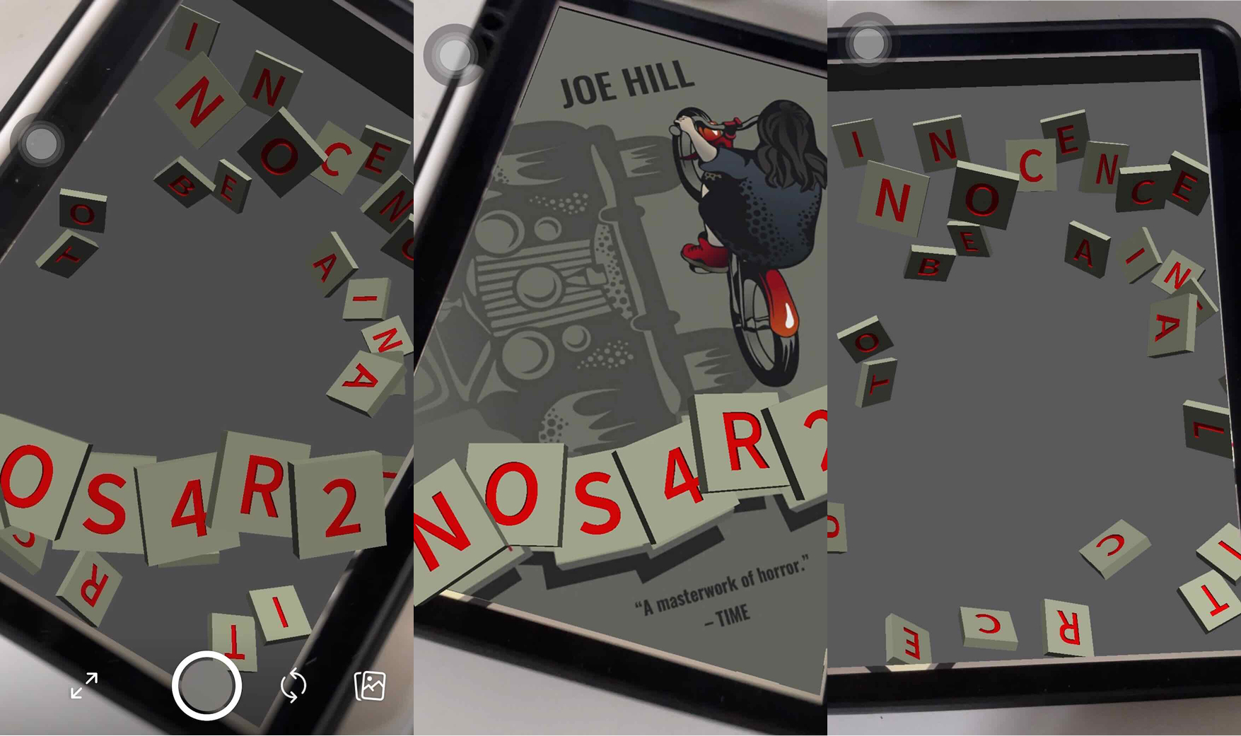
AR effect
Uncovering the hidden message
An augmented reality effect was developed with the first cover as the base to give readers a unique experience with the novel. In the story, Scrabble tiles connect an individual to their supernatural world. To mirror that in this experience, the tiles act as a bridge between the readers and the novel's fictional world. The audience first encounter the Scrabble tiles on top of the cover, then uncover a different set of tiles forming a message as they move closer.
The 3D models of the Scrabble tiles were made in Cinema 4D, imported into Spark AR to set up the distance trigger, then published as an Instagram filter.
Reflection
I learned more about design layouts throughout this process. Looking back, I should have explored colours and stylistic directions more thoroughly. Since the time allotted for the first iteration was limited, I quickly chose a colour palette and went with it. Although I still like the first cover, had I explored and experimented more, I could have made a design that I was happier with the first time.